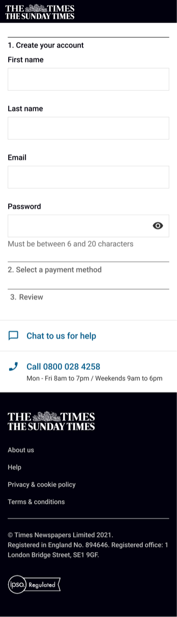
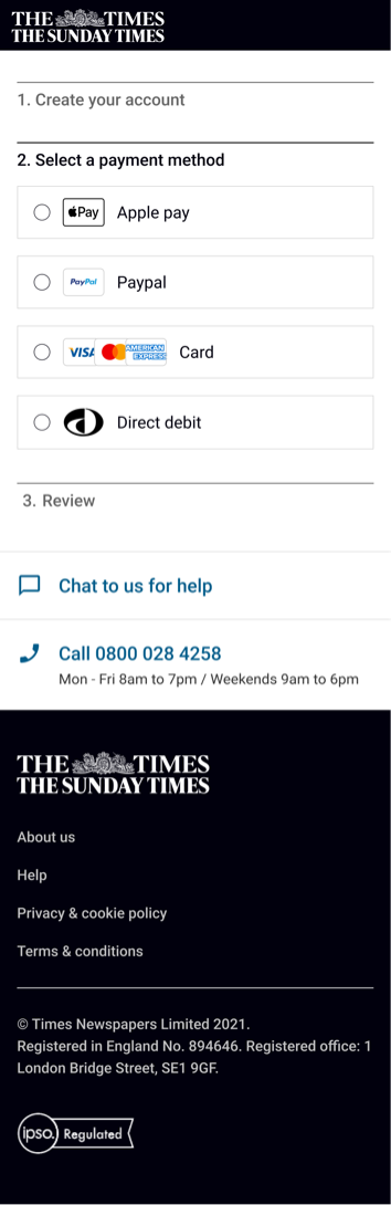
Too many steps
- Name, email and password are split across separate steps for no clear reason.
- Competitors run shorter journeys with fewer steps than ours.
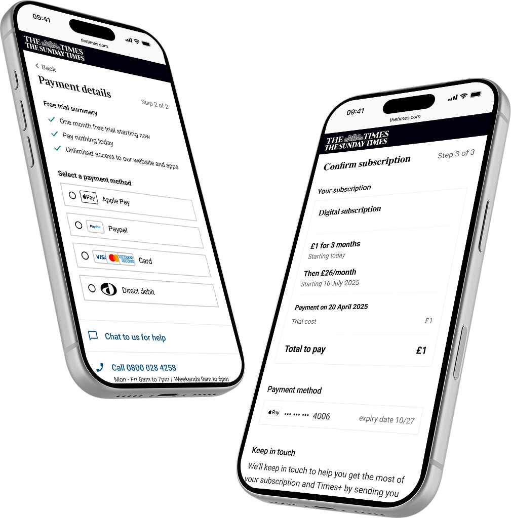
I led the redesign of The Times' subscription checkout, from research through to validated, shipped improvements that measurably grew conversion and marketing opt-ins.
The Times aimed to increase conversion by improving the checkout experience. The existing journey was long, fragmented, and hadn't been updated in years.
Information was spread across too many steps. Users dropped off mid-flow because of unclear pricing, redundant fields, and a UI that didn't match the rest of the site.
Prioritised solutions from an audit, competitor research, and a stakeholder workshop. Designed and validated a streamlined journey that reduced steps and clarified key information.
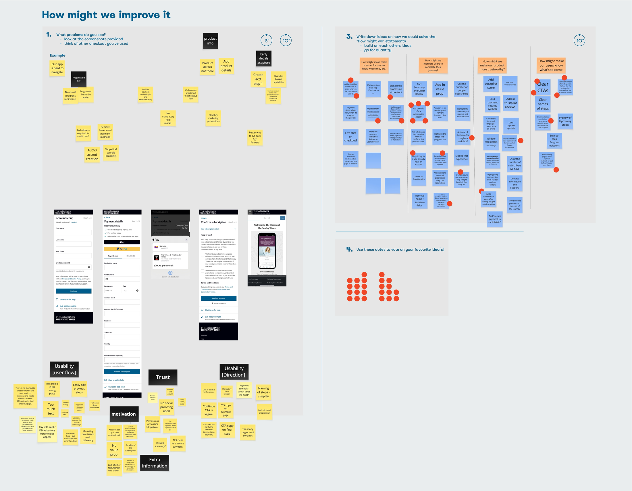
To figure out what needed to change, I ran three activities: an audit of the existing checkout, competitor analysis, and a prioritisation workshop with the product team.
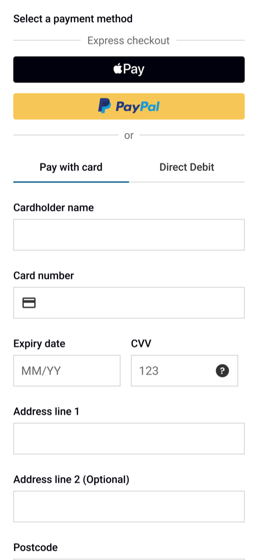
When you lay out every step of the existing checkout side by side, the first thing that hits you is the volume. Too many steps, too many fields, and a visual language that felt disconnected from the rest of The Times.
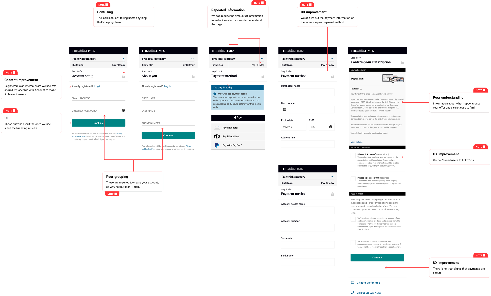
I benchmarked the audit findings against leading subscription services. The same fixes came up on both sides: increasing trust and making the journey easier to complete.
I shared my findings with the product team and we ran a prioritisation exercise to agree on what to tackle first. This gave us a clear, shared direction and buy-in from stakeholders before any design work started.
With clear priorities agreed, I turned research into hypotheses and started designing and testing a streamlined checkout.
We believe that potential subscribers will be less likely to drop out of the journey if we reduce the number of steps, leading to an increase in subscription conversion.
We believe that potential subscribers will be more likely to subscribe if they are re-assured through trust signals, leading to less drop off.
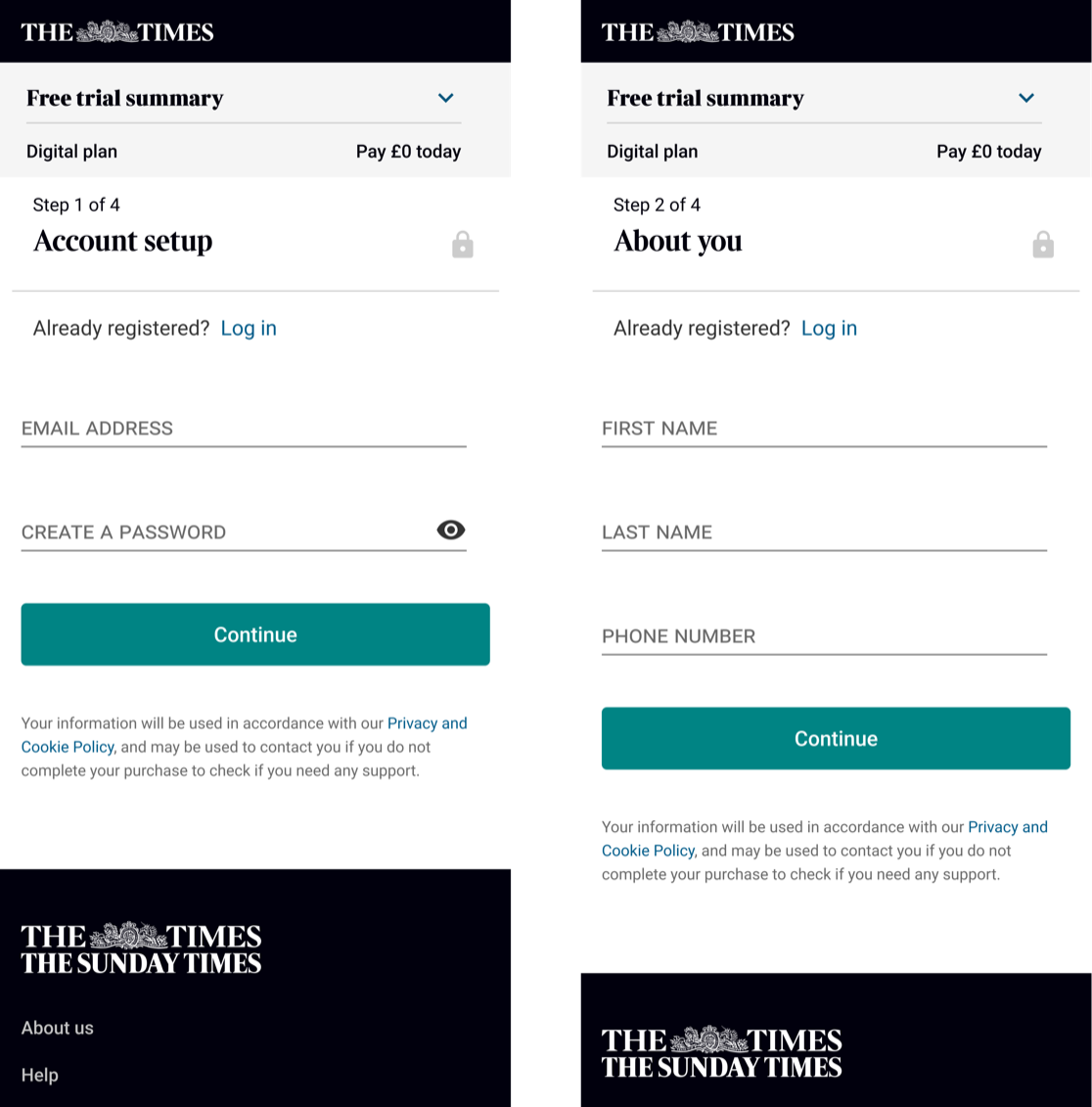
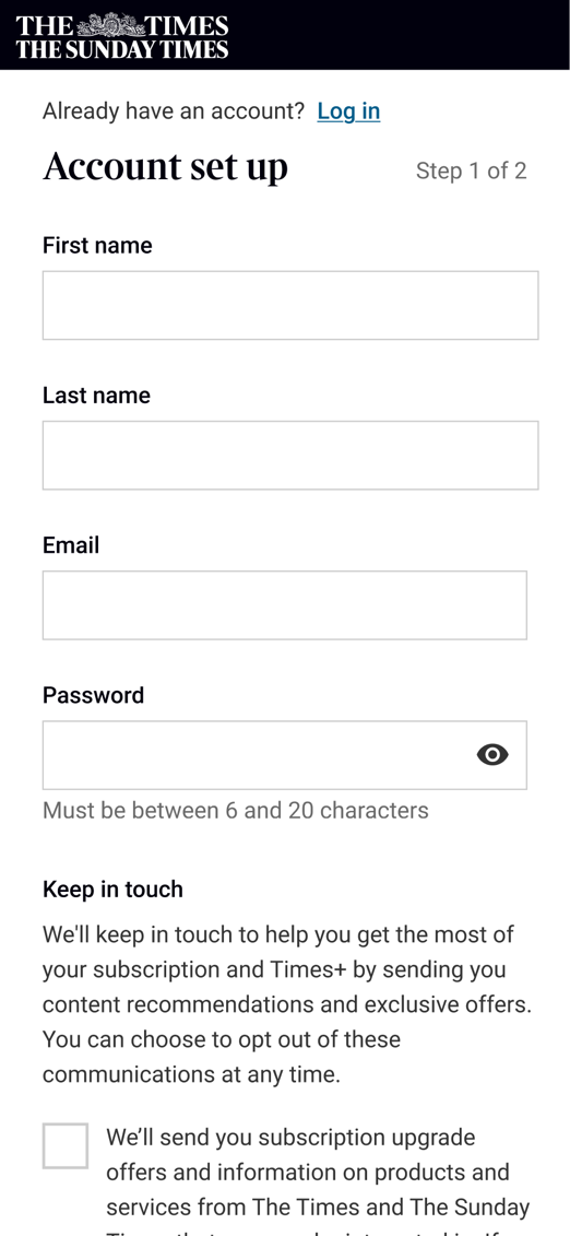
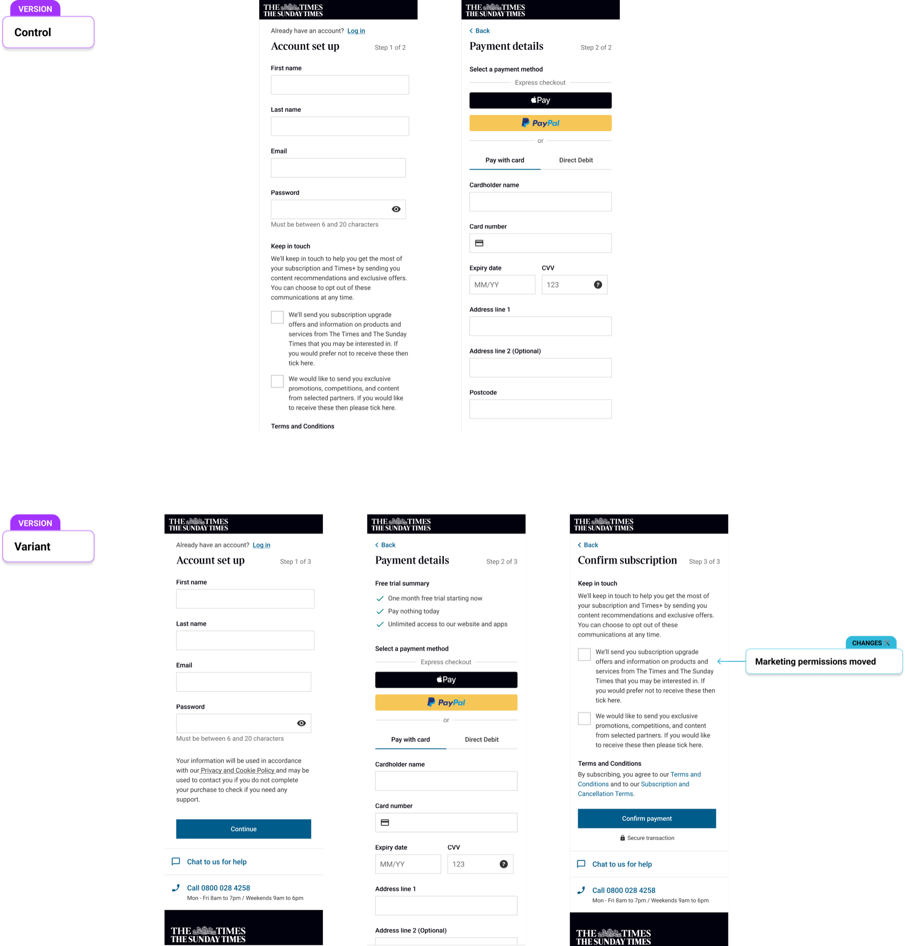
Combining the account creation into one step and moving marketing permissions to the front of the journey.
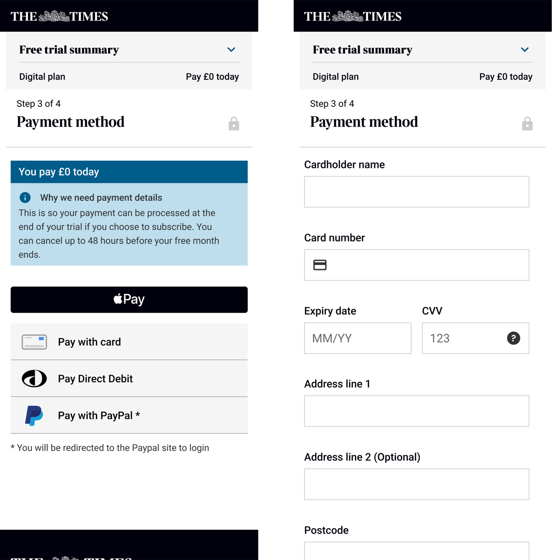
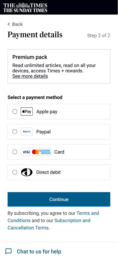
Turning the payment selection into one step.
With the mockups built into a prototype, it was time to put it in front of real users and see whether the changes actually worked.
I ran usability tests with 10 participants (6 on desktop and 4 on mobile) using the prototype to measure task completion, perceived speed, and confidence in the purchase.
Faster. Clearer. More trustworthy.
With this validated, the engineers built the new journey and we launched it as an A/B test.
We saw a 5% increase in conversion, which is what we wanted, but marketing opt-ins dropped by 45%. Looking at the result, I proposed two hypotheses for what caused it.
The new journey moved the marketing permissions to a different point in the flow from the control. Where they appeared could be changing how many people chose to opt in.
Compared with the control, the new page made it much more obvious that these were marketing permissions. That clarity could be making people less likely to tick them.
We decided to test placement, moving the marketing permissions closer to where they sat in the control.
+4.5%
subscription conversion
This variant increased subscription conversion by +4.5% and marketing opt-ins by 10%. While subscription numbers didn't outperform the 2-step journey, the marketing permissions uplift meant additional revenue from re-engagement when users cancelled.
The numbers told a clear story: a simpler, more transparent checkout doesn't just convert better, it builds the kind of trust that pays off downstream.
Before moving to a new team, I documented a set of test hypotheses for the next iteration. The end goal: determine whether a single-page checkout would work best for The Times, progressively reducing friction until the journey is as short as it can be without hurting trust.
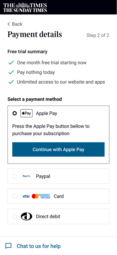
We believe that potential subscribers will find it easier to choose a payment method if they are all presented equally, leading to an increase in subscription conversion.
Lever Pre-selecting the fastest payment method by default
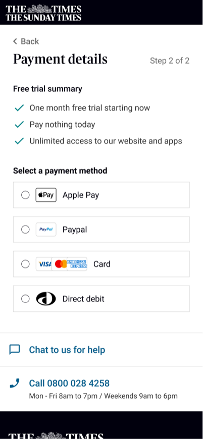
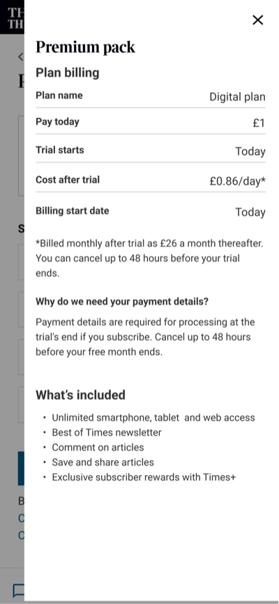
We believe that potential subscribers will be less likely to drop out of the journey if they are able to preview the subscription details, leading to an increase in subscription conversion.
Lever Providing detail about the subscription throughout the journey
We believe that potential subscribers will be less likely to drop out of the journey if it is over one page, leading to an increase in subscription conversion.
Lever Make the journey feel shorter by having it on one page