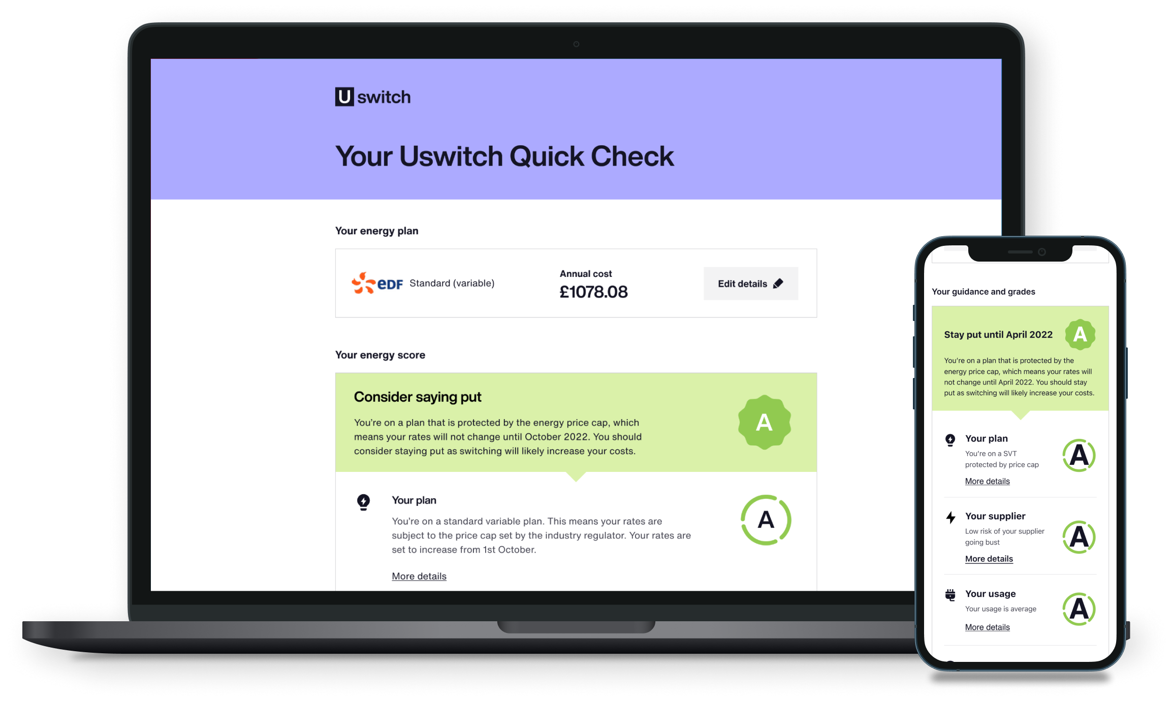
The Quick Checker shown on laptop and mobile
Uswitch

Creating
the Uswitch
Quick Checker

When the energy crisis killed switching, Uswitch's core product became useless overnight. I designed the Quick Checker, a new tool that gave users the guidance they needed and kept Uswitch relevant until the market recovered.

Role
UX, UI, User Research
Team
Product, Engineering,
Data
Duration
8 weeks

Users could no longer switch energy providers. Prices were rising, suppliers were going into administration, and people didn't know what to do.

Uswitch's core product, energy switching, was dead. The business needed to find a way to keep users engaged until the market recovered.

The Quick Checker: a tool that gave users the information they needed to navigate the crisis, kept Uswitch relevant, and encouraged them to return when switching came back.

Impact
200k Monthly returning users
5% Email sign-up rate for updates
1.9→3.5 User satisfaction score improvement
Step 01

Validating the problem

With a big shift in the energy market, I led user testing to validate whether our switching product still met users' needs. The research revealed three things.

Product no longer useful

  • Research validated that the switching product no longer matched users' needs.
Users felt unsettled

  • Rising bills, supplier collapses, and no available plans left users anxious and looking for guidance.

New direction needed

  • A change in product direction was needed, not just a UI update.
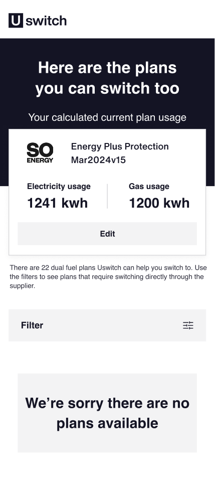
The old switching page after a search returns no results: 'We're sorry there are no plans available'
The empty state users hit once switching plans dried up
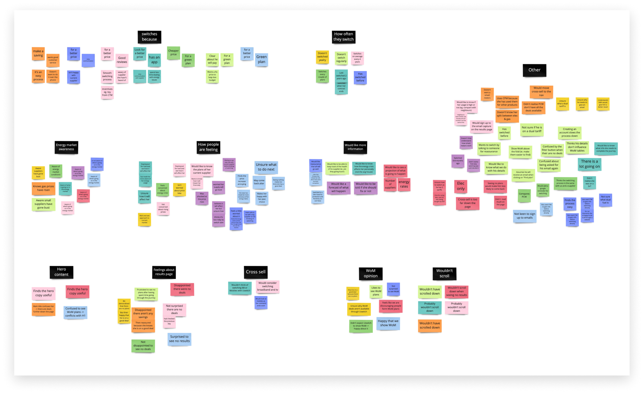
Affinity-mapped research findings clustered by theme: switching motivations, energy market awareness, feelings about the results page, cross-sell, word of mouth, and more
Research artefacts from the validation sessions
Step 02

Defining the solution

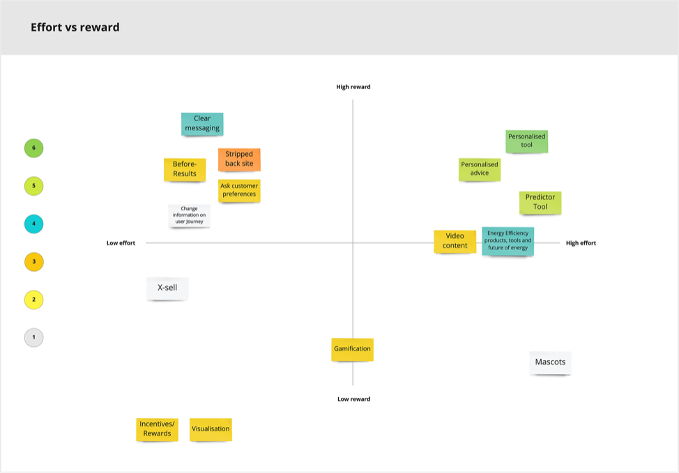
I planned and ran an ideation workshop with the product team (engineers, product, data analysts) using the research findings as a starting point. We used ideation cards to generate solutions, then grouped and assessed them.
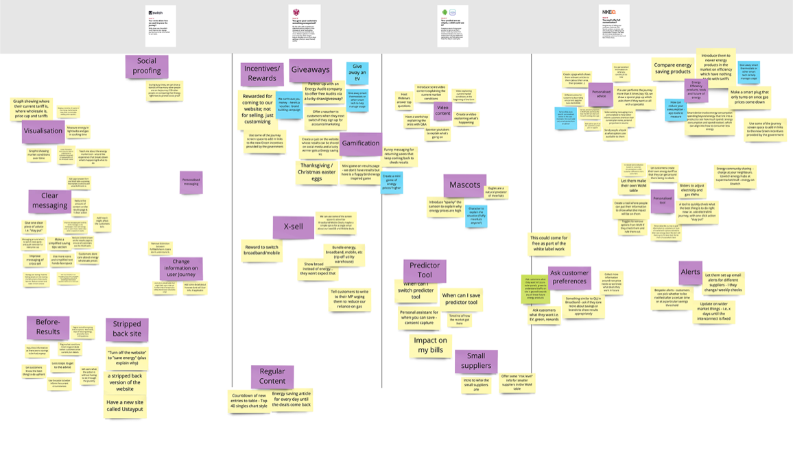
Brainstormed ideas grouped by theme: social proofing, clear messaging, incentives and rewards, gamification, mascots, predictor tools, and alerts
Ideas plotted on an effort-versus-reward quadrant, with personalised tools and advice standing out as high-reward
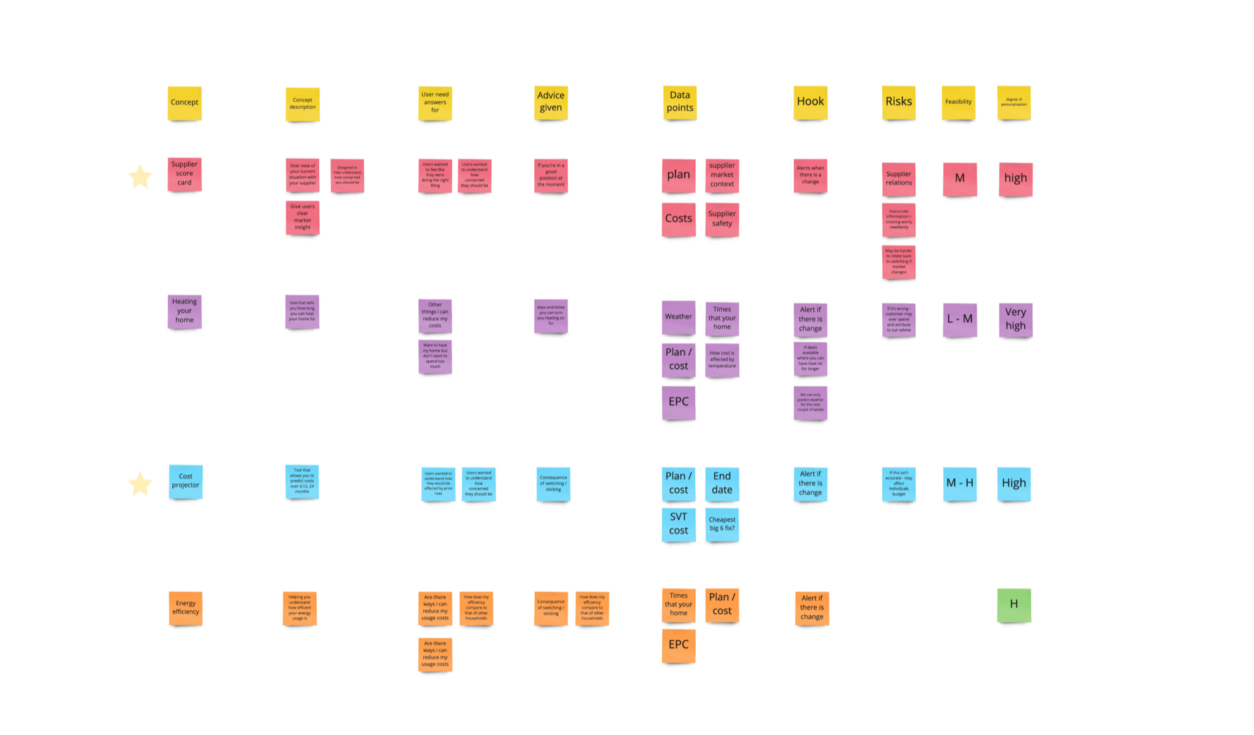
Concept ideas scored against user need, advice given, data points, hook, risk, feasibility and degree of personalisation: Supplier score card and Cost projector starred as top candidates
Figuring out what we could do, based on risk, the data we'd need, and the data we already had
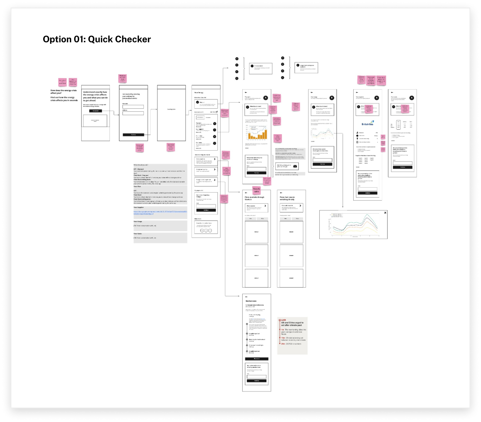
Sketched wireframe flow for the selected Quick Checker concept, annotated with sticky-note feedback
Selected ideas sketches

Choosing a direction

We assessed each option on user value, business value, available data, and risk. I presented our recommendation to the product team, and we agreed to move forward with the Quick Checker.

Step 03

Testing the Quick Checker

I ran moderated usability tests to validate the concept before engineers built it. I reused the same metrics from the initial research so we could directly compare whether the Quick Checker better matched users' needs.

What we built

Testing confirmed the Quick Checker's value, showing improvements in both usefulness and satisfaction. The key features were:
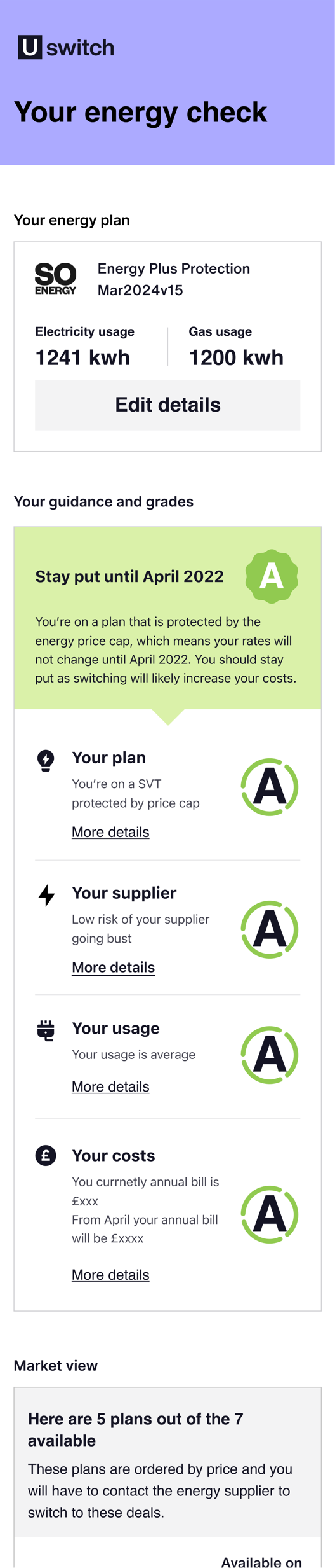
  • A personalised energy grade
  • Insight into their plan, supplier, usage, and cost
  • Notifications on grade changes and new plans
  • Market overview, including plans not on Uswitch
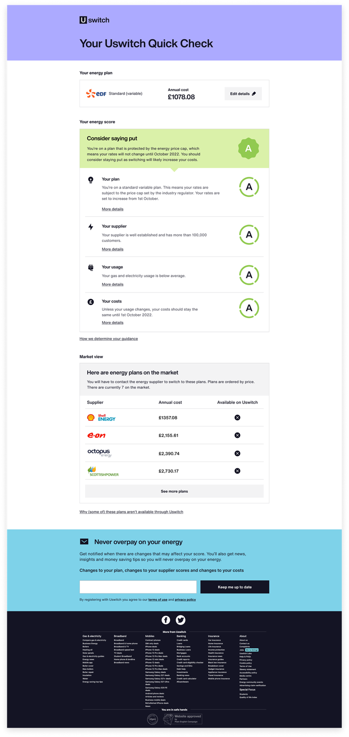
The full Quick Checker flow used in testing: energy plan summary, personalised guidance and grades, and the start of the market view
The prototype used in moderated testing

The Quick Checker

The shipped product: a personalised grade, the detail behind it, a view of the wider market, and updates when either changed.
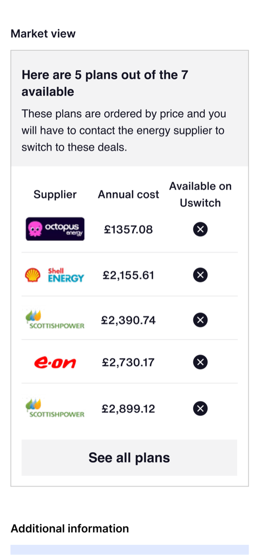
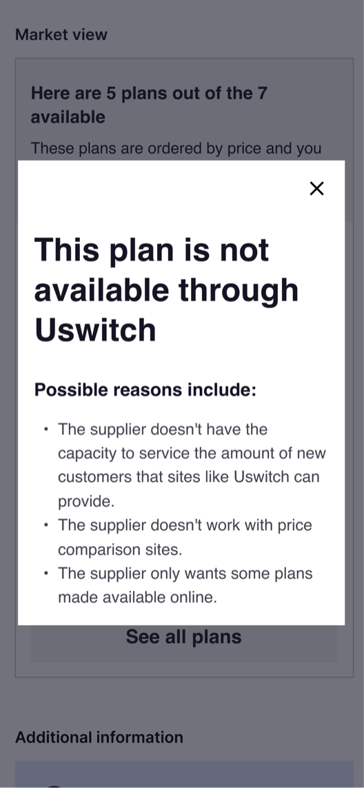
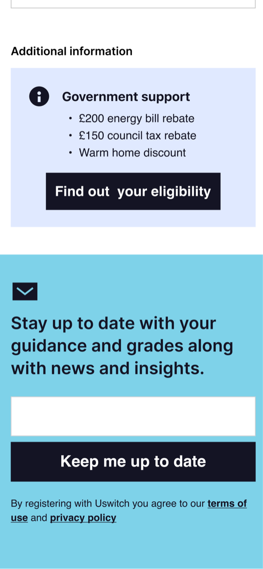
Quick Checker market view: five available energy plans ranked by annual cost, flagged for availability through Uswitch A modal explaining why a specific supplier's plan isn't available through Uswitch Government energy support information and an email sign-up for grade and market updates
Market view, plan availability, and additional support
The Quick Checker on mobile: energy plan summary, personalised guidance and grades, and the start of the market view
The Quick Checker on desktop: the same energy plan, score, market view and sign-up, laid out for a wider screen
Mobile and desktop
The Result

1.9 → 3.5

user satisfaction score

We launched the Quick Checker as an A/B test alongside an onsite survey. User sentiment rose from 1.9/5 on the empty switching page to 3.5/5 with the Quick Checker. We rolled it out to 100% of traffic.

Over the next three months: 200,000 monthly returning users and a 5% sign-up rate for grade and plan updates, creating a contactable base for when energy switching returned.

Reflections

What I'd do differently

Grade communication needed more iteration

  • Users struggled to interpret their energy grade: some weren't sure if a "B" was good or bad.
  • More iterative testing on the grading system could have improved comprehension and confidence.

Long-term sustainability

  • Every energy market announcement now requires manual updates to the guidance.
  • A simpler, more rule-based system could have reduced this ongoing effort and freed the team for new opportunities.