30% had access beyond their tier
- The system couldn't enforce feature restrictions: users on lower-tier packs could reach premium features without upgrading.
- Nearly a third of the subscriber base was getting more than it paid for.
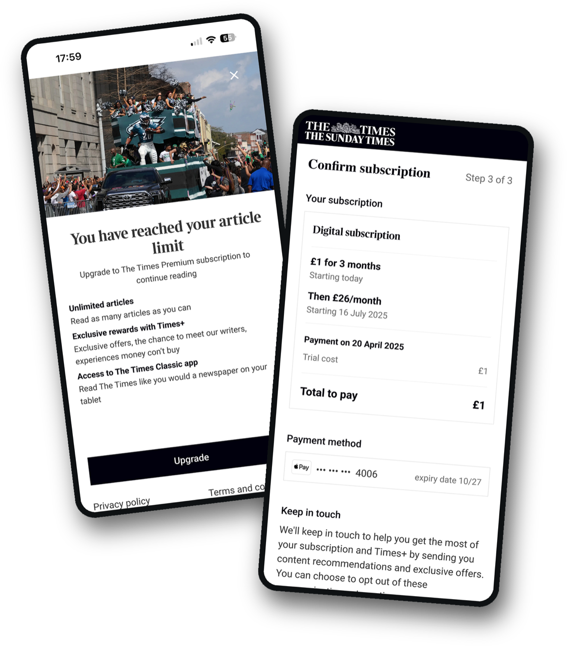
I led the redesign of The Times' subscription architecture and upgrade experience, rebuilding how features are gated to unlock new revenue opportunities and give users a self-serve upgrade path.
Years of underinvestment in The Times' technology infrastructure had left the subscription system unable to do the one thing it existed to do: control who gets what.
Features couldn't be restricted, marketing couldn't build new pack variations, and upgrading meant phoning customer services: a revenue leak on three fronts.
Rebuild subscriptions around individual entitlements so any combination of features could be packaged and sold, and give users a self-serve upgrade journey to measure and improve.
Years of underinvestment in The Times' technology infrastructure had created a broken subscription system. The problems manifested in three ways.
The project had two objectives.
Rebuild the feature system to allow proper feature gating, and give marketing the flexibility to create any combination of features in a subscription pack.
Create a web-based upgrade journey so users can self-serve, establishing baseline metrics for future optimisation.
We had no baseline data for revenue loss or upgrade conversion, so the focus was establishing a foundation rather than improving an existing journey. Our key outcomes were:
Flexibility to create any combination of features in a subscription pack.
A baseline journey to iterate on and establish metrics for future optimisation.
Encouraging users to upgrade to a higher tier pack.
I ran a workshop with stakeholders from marketing, engineering, and senior leadership to reframe how we thought about subscriptions. Rather than upgrading from "Pack A to Pack B", we focused on individual entitlements.
By breaking down packs into independent features (offline reading, article limits, app access, specific content sections) we could create a flexible system where marketing could combine any features into a subscription. The workshop aligned everyone on the logic for each feature.
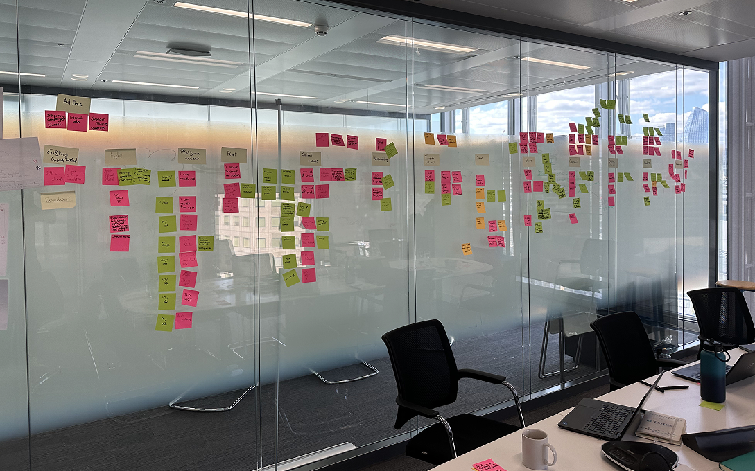
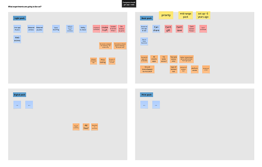
There was one main issue to solve: how do you let users discover premium features exist without creating constant frustration from being blocked? I looked at what competitors were doing.
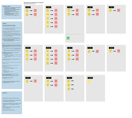
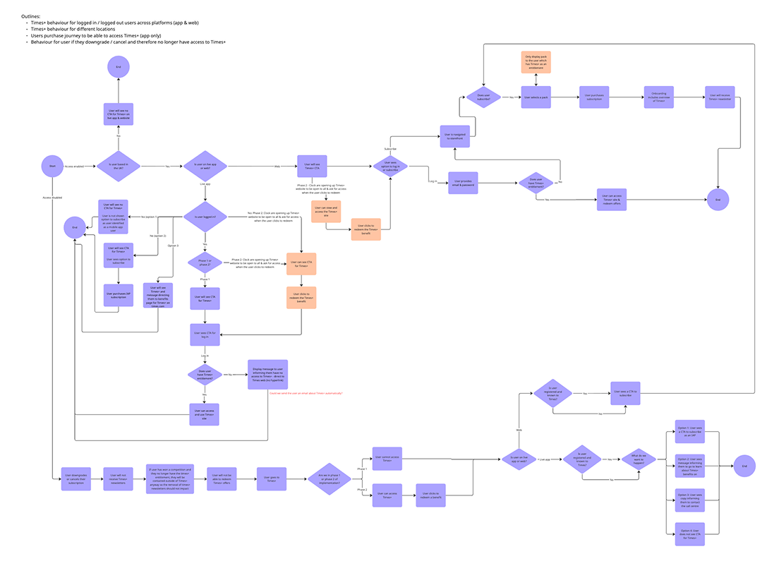
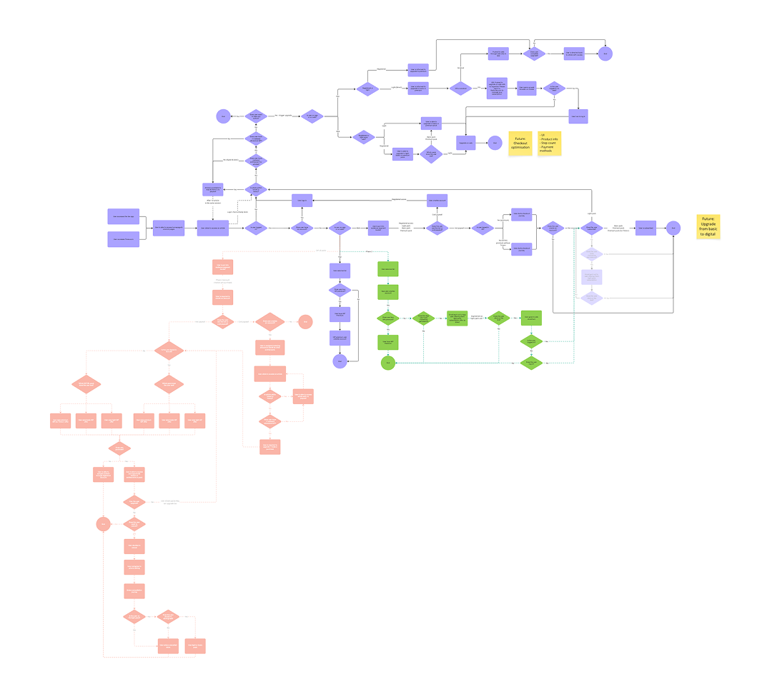
Before designing what blockers to use and how they should look, I mapped out how they would work. This meant engineers could start building the logic while I designed, and it showed stakeholders the true complexity of the project.
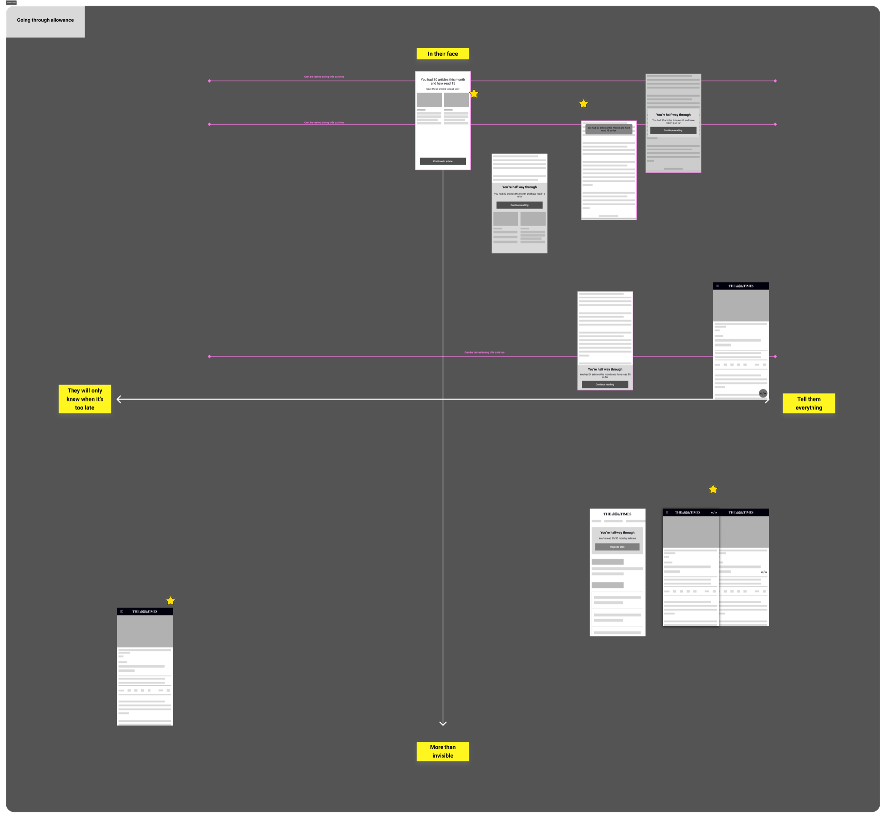
I figured out what I could influence for each feature, sketched ideas based on those factors, then plotted them on a matrix to see how many genuinely different directions I had. This made it clear which ideas were worth testing versus which were just the same concept done slightly differently.
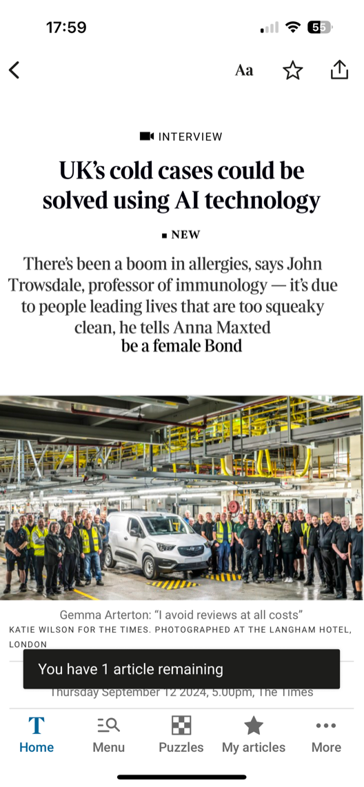
We decided to prioritise reusing existing components for the MVP. This wasn't about creating the optimum experience, it was about establishing functionality quickly to create a baseline. The engineering effort to rebuild the entire entitlement system meant we needed to be pragmatic about the UI.


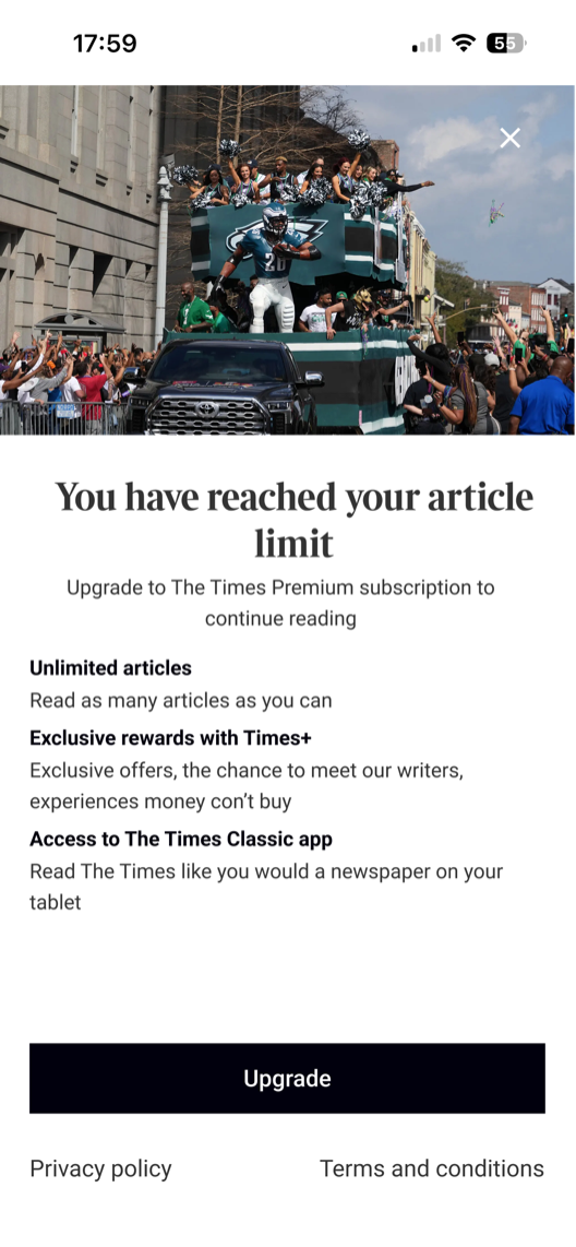
Engineering uncovered a major constraint: we could upgrade a user's pack immediately, but couldn't change their billing date. Combined with introductory offers, one component had to clearly communicate:
One new component was needed: a price recap on the confirmation screen. We needed to explain future payments for compliance, and previous user testing had shown users wanted more information about costs. I used Figma agents to rapidly iterate through layout variations before narrowing in on the final design.
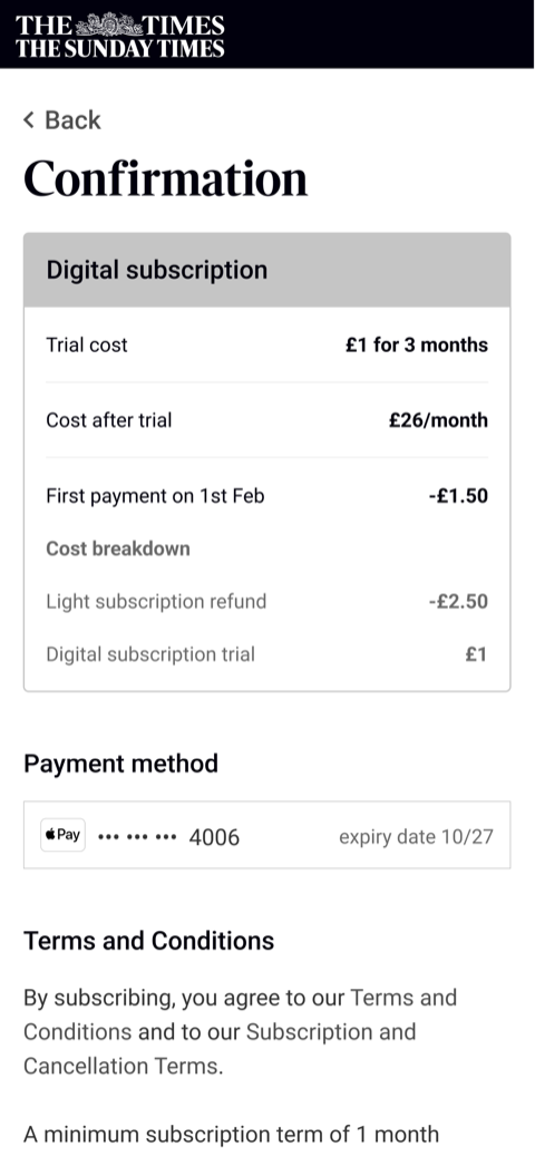
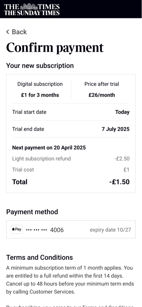
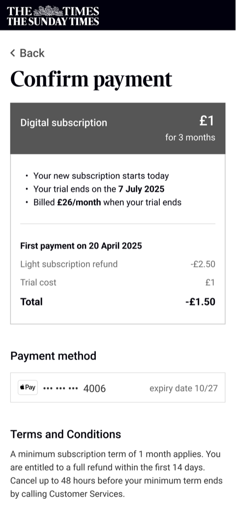
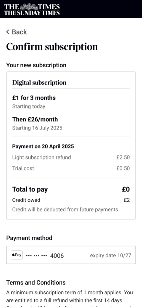
I ran three rounds of usability testing with 15 participants each, focusing on clarity and usability. Could users understand how much they'd pay and when? Did they trust the upgrade journey?
The first round revealed users could navigate the flow but wanted much more detail about costs. I went through six iterations on the payment explanation, adding a dedicated section on the confirmation page.
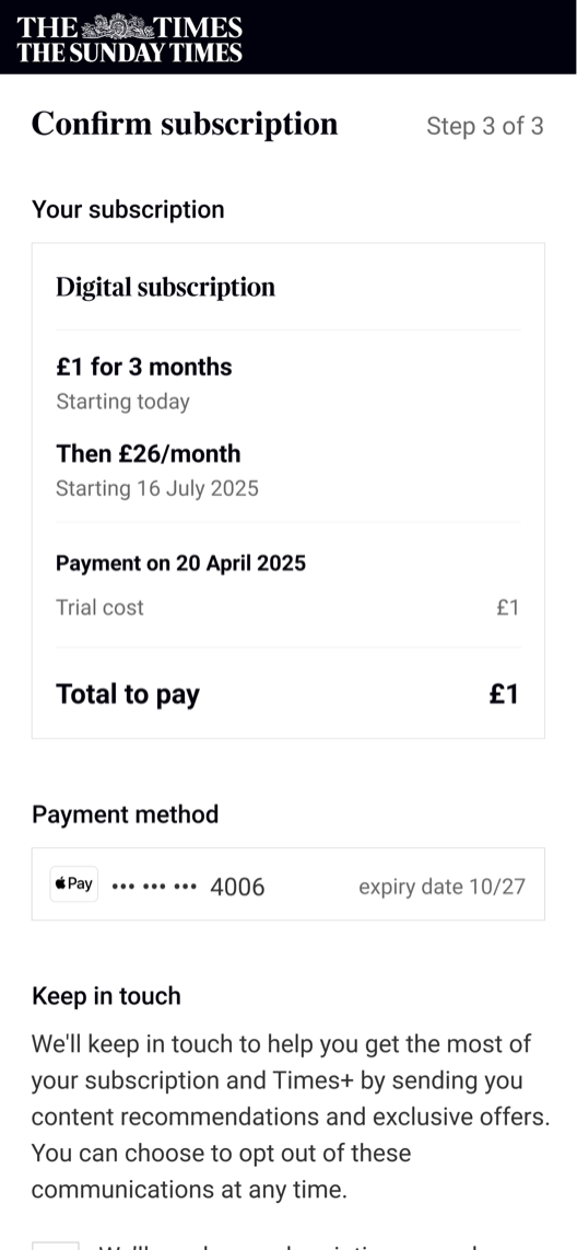
90% understood when they'd pay, how much they'd pay, and that they'd get credit towards future payments.
With the journey validated, engineering built it into the rebuilt entitlement system and we launched.
The immediate outcome was capability, not conversion. For the first time, The Times could properly gate features, and sell whatever it wanted to build.
5%
of newly-gated users upgraded
All users were now restricted to their appropriate tier, closing a gap that had let 30% of subscribers read beyond what they paid for. But being gated no longer meant being stuck: for the first time, those users could upgrade themselves on the web rather than phoning customer services, and 5% of them did.
That's the number that mattered most: not because it was high, but because it existed at all. It gave us a real baseline to improve on, and proof that self-serve upgrades were worth building further.