I led the redesign of The Times' subscription architecture and upgrade experience over 4 months, working as the sole product designer responsible for research, UI, and content design. The aim of this project was to allow the marketing team from creating new subscription by rebuilding how features work and create the opportunity to increase revenue by encouraging users to upgrade with an online upgrade journey and gating features.
UX, UI, User research, Content
Rebuilding The Times subscription system
Role
9:41


Rob
Home
About
Background
A Broken foundation
Years of underinvestment in The Times' technology infrastructure had created a broken subscription system. The problems manifested in three ways:
30% of subscribers had access to features beyond their tier
Through analytics, we identified that nearly a third of our users were receiving features they weren’t supposed to have—primarily because the system couldn't properly enforce feature restrictions (users on lower-tier packs could access premium features without upgrading).
Marketing couldn't create new subscription offerings
The team had a list of pack variations they wanted to test: puzzles-only subscriptions, app-only access, news section bundles (such as news+sport), and different article meter thresholds... but the system made these impossible to build.
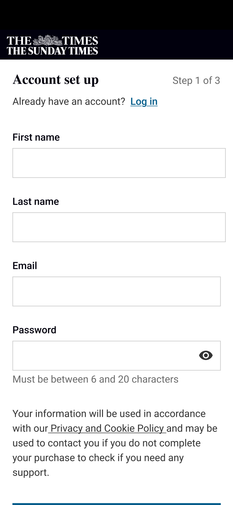
No web-based upgrade path existed
Users wanting to upgrade had to phone customer service.
This wasn't a user pain point in the traditional sense—users weren't complaining because they were already getting more than they paid for. But it was a potential revenue leak and limited our ability to increase revenue.
Goals
The project had two objectives:
Rebuild the feature system
to allow proper feature gating and give marketing the flexibility to create any combination of features in a subscription pack
Create a web-based upgrade journey
that would allow users to self-serve upgrades and establish baseline metrics for future optimisation
Measuring success
We had no baseline data for what revenue we were losing or what upgrade conversion should look like, which made this project’s focus about establishing a foundation for future growth rather than improving an existing journey. Our key outcomes were:
Marketing being able to create packs independently
to give them the flexibility to create any combination of features in a subscription pack
User being able to upgrade online
to have a baseline journey to iterate on and establish baseline metrics for future optimisation
Features being gated
to encourage users to upgrade to a higher tier pack
Discovery & Validation
Shifting stakeholders mental model
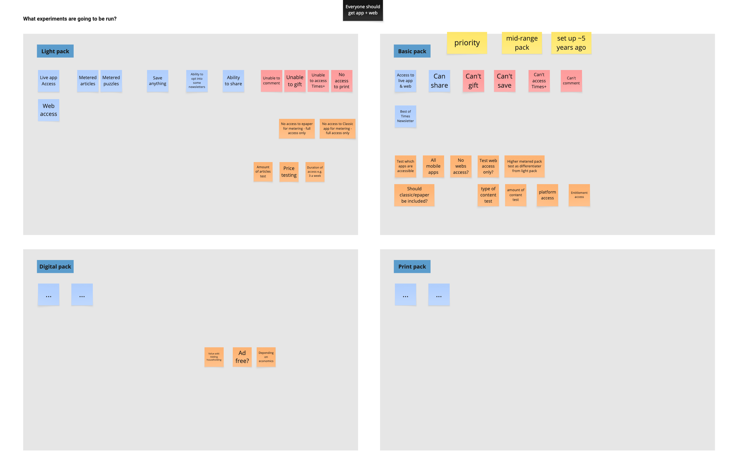
I ran a workshop with stakeholders from marketing, engineering, and senior leadership to reframe how we thought about subscriptions. Rather than thinking about upgrading from "Pack A to Pack B," we focused on individual entitlements: what happens when a user does or doesn't have access to a specific feature?
This shift was critical. By breaking down packs into independent features (offline reading, article limits, app access, specific content sections), we could create a flexible system where marketing could combine any features in a subscription. The workshop aligned everyone on the logic for each feature.
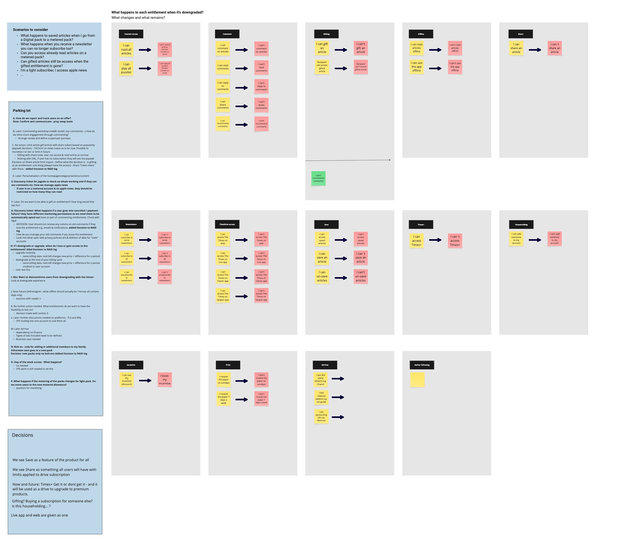
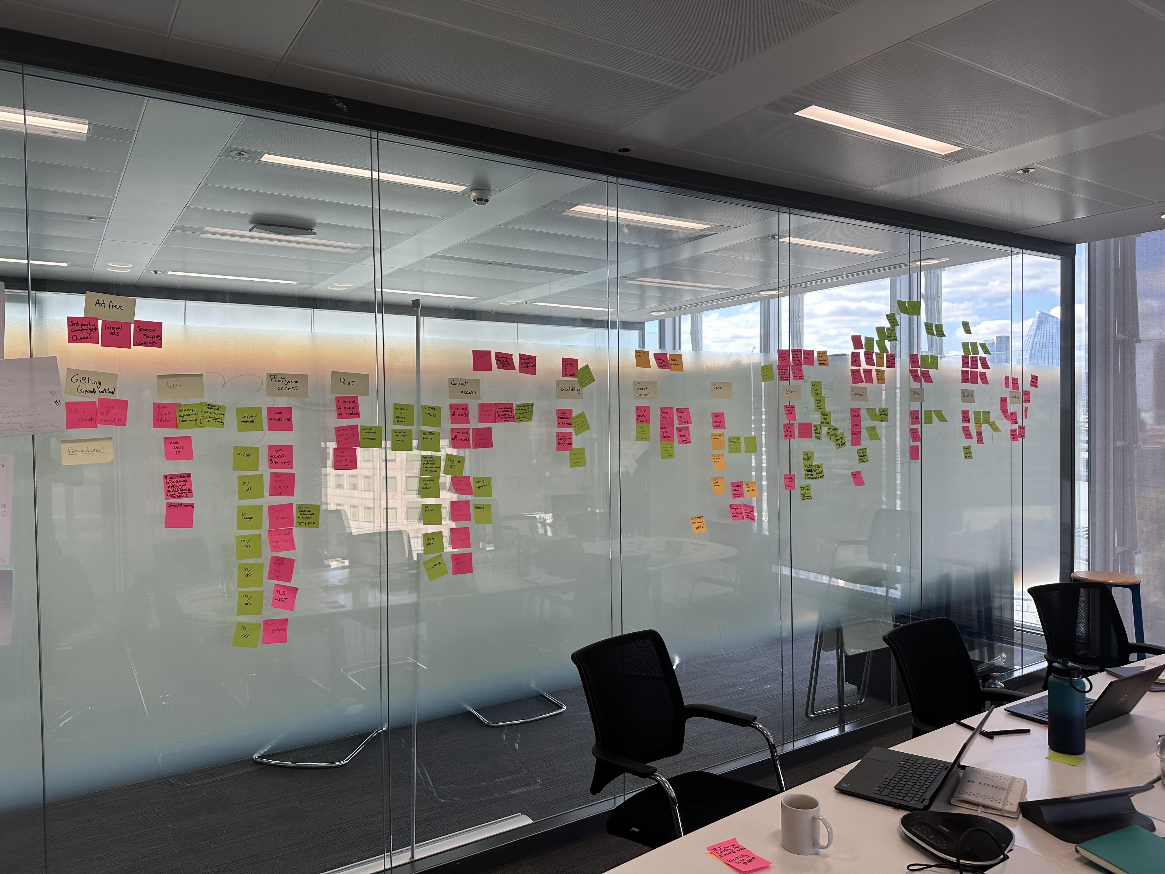
Defining the features workshop
Balancing discovery and restriction
There was one main issue to solve: how do you let users discover premium features exist without creating constant frustration from being blocked?
To start to figure this out I looked at what competitors were doing to encourage users to upgrade. The key findings were:
If you don’t have it, you get blocked
It’s pretty standard to see all features and when interacting with one you don’t have, you get a blocker (sheets, modals, redirects). Spotify doesn’t do that with all of it’s features though, you can only see different audio quality depending on your subscription, something which could be useful for us.
Online upgrades really are standard
Everyone (and not just in media – surprisingly) has an online upgrade journey. I already knew this (and I’m sure you do too) but this really proved that we needed to adopt basic best practices of the internet (we were originally a newspaper company so may that may explain why we were a little behind...)
Design
How to block
Before designing what blockers to use and how they should look, I mapped out how they would work. This meant the engineers would be able to get started sooner by building the logic and showing this to stakeholders highlighted the complexity of this project and show why it would take some time to build.
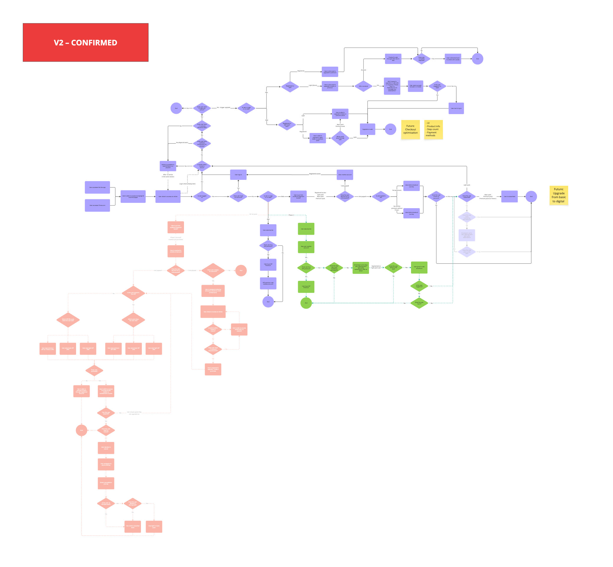
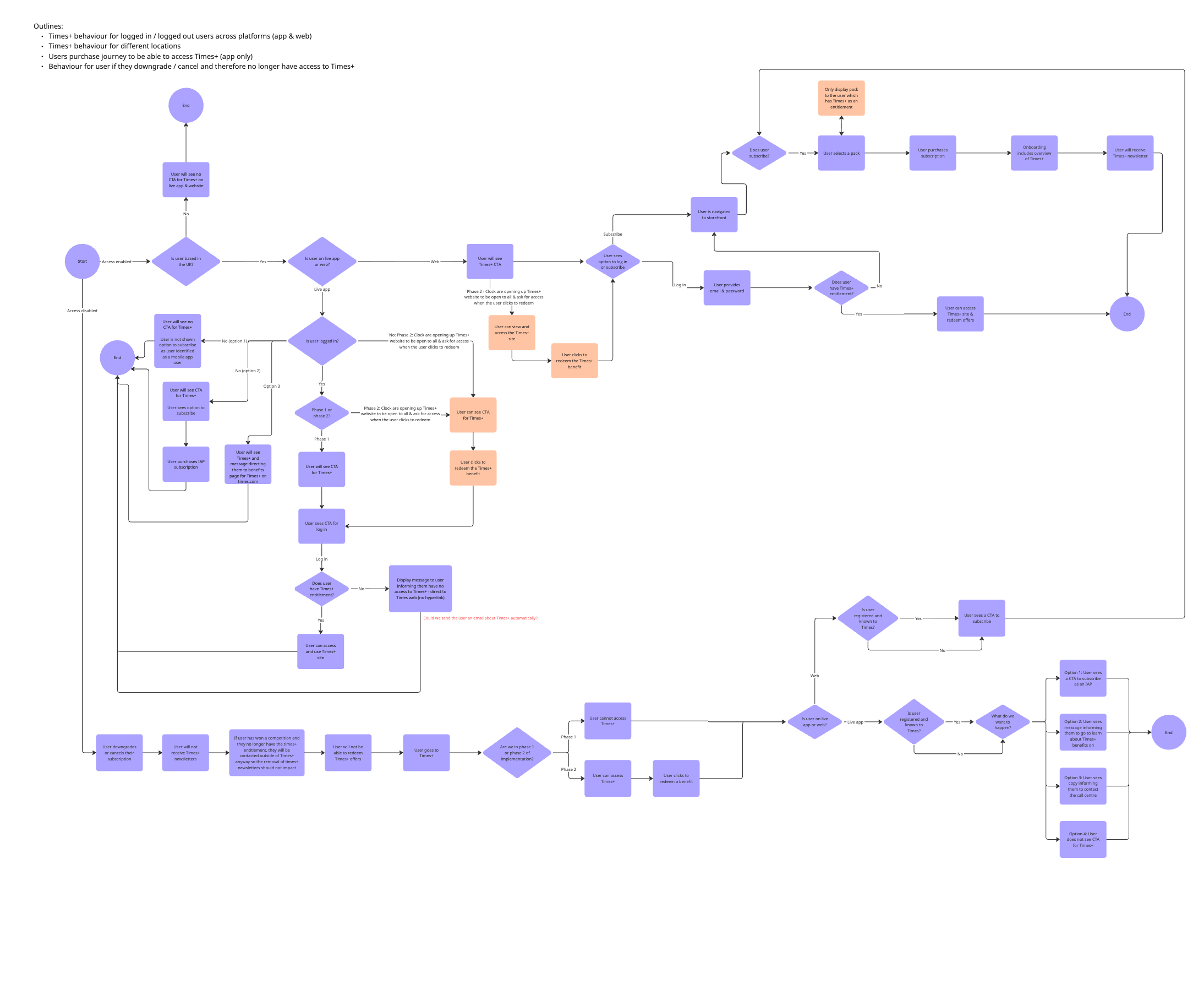
Entry points + blocker framework (I need to create that)
Now that I knew when each blocker would be triggered, I focused on what the blocker should be and how it could work. To be able to do this, I figured out what I could influence for each feature, and sketched ideas based on those factors. Then to know which ones to run a usability test on, I plot them on a matrix to see how many different ideas I have I actually have. I’ve find these steps really useful for a few reasons:
- It’s a great visual to show stakeholders and other designers (it’s a lot easier to talk about something you can see after all). It’s helped me
- It makes it super clear how many directions for an idea I actually have. In the past I used to think I would have loads of different ideas whereas I actually had the same one, it was just done slightly differently which isn’t worth testing at this early stage.
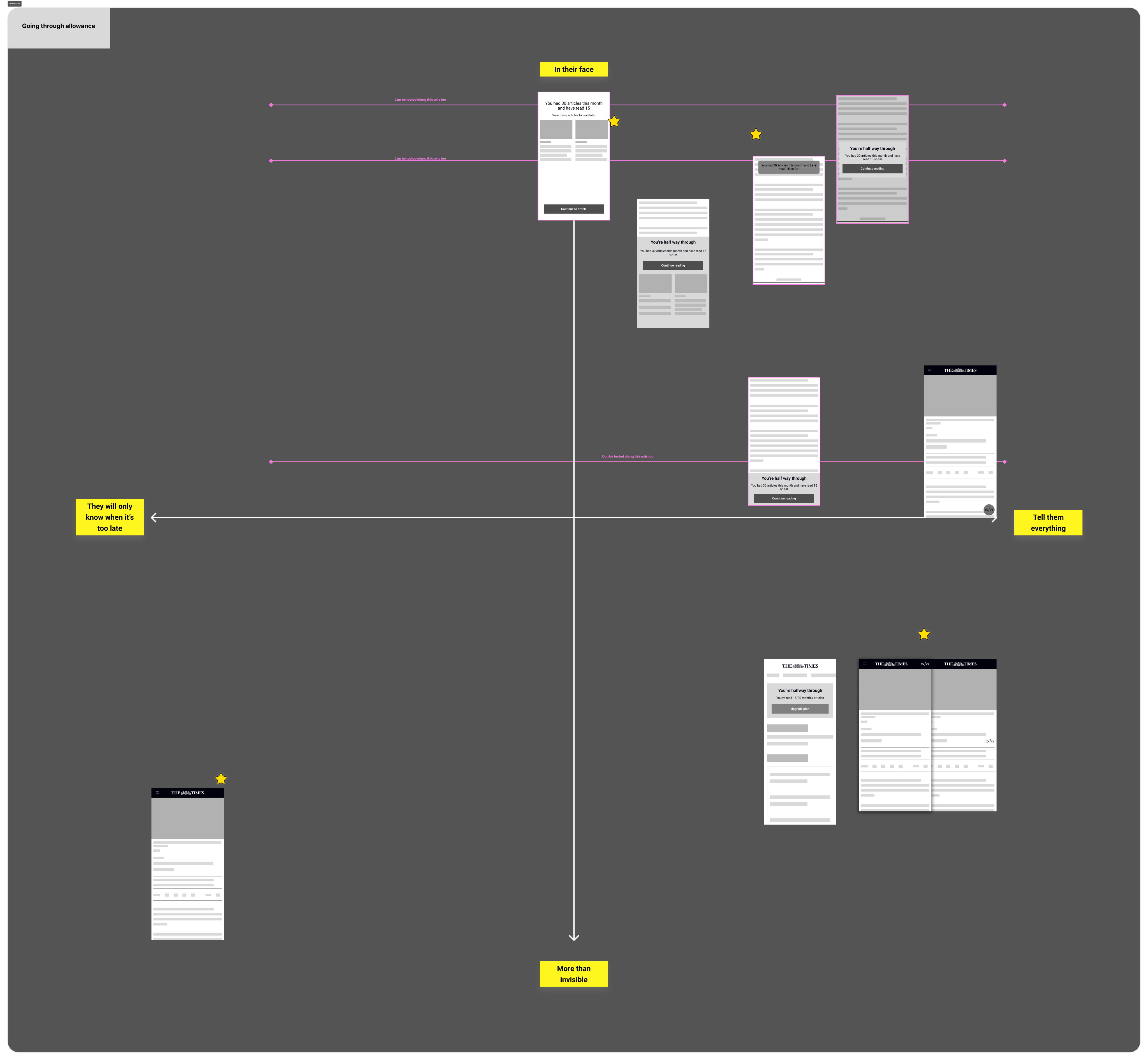
Concepts vs ideas matrix
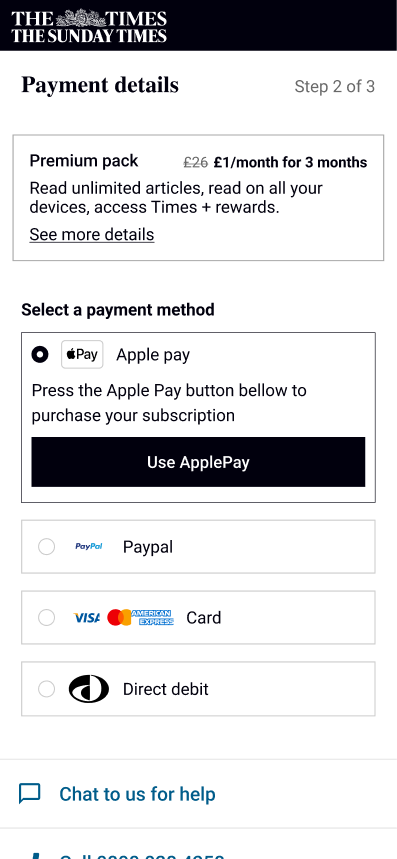
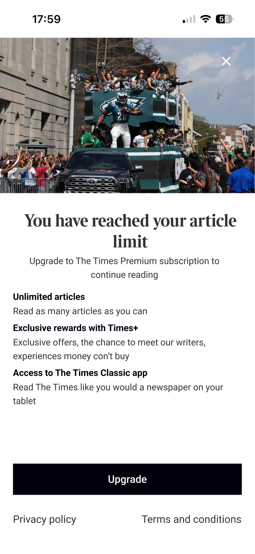
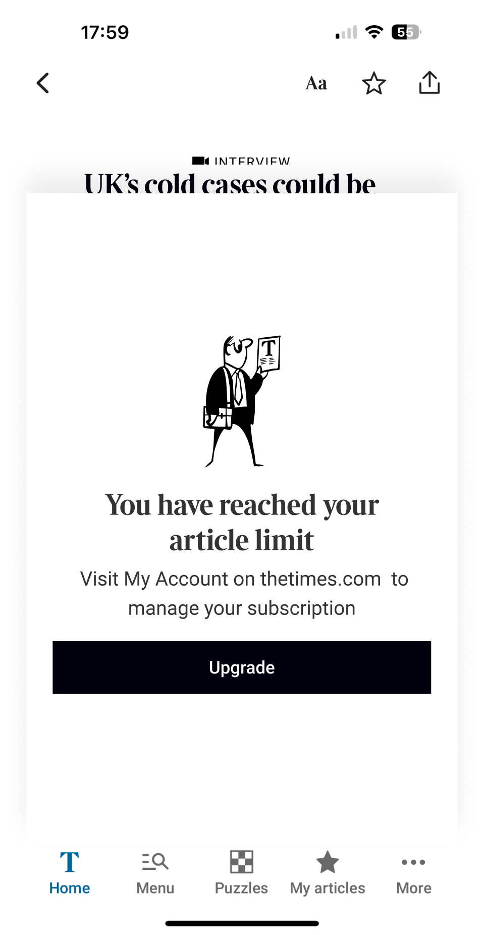
In the end we decided to prioritise reusing existing components for the MVP. This wasn't about creating the optimum experience—it was about establishing functionality as quickly as possible to create a baseline. The engineering effort required to rebuild the entire entitlement system meant we needed to be pragmatic about the UI.
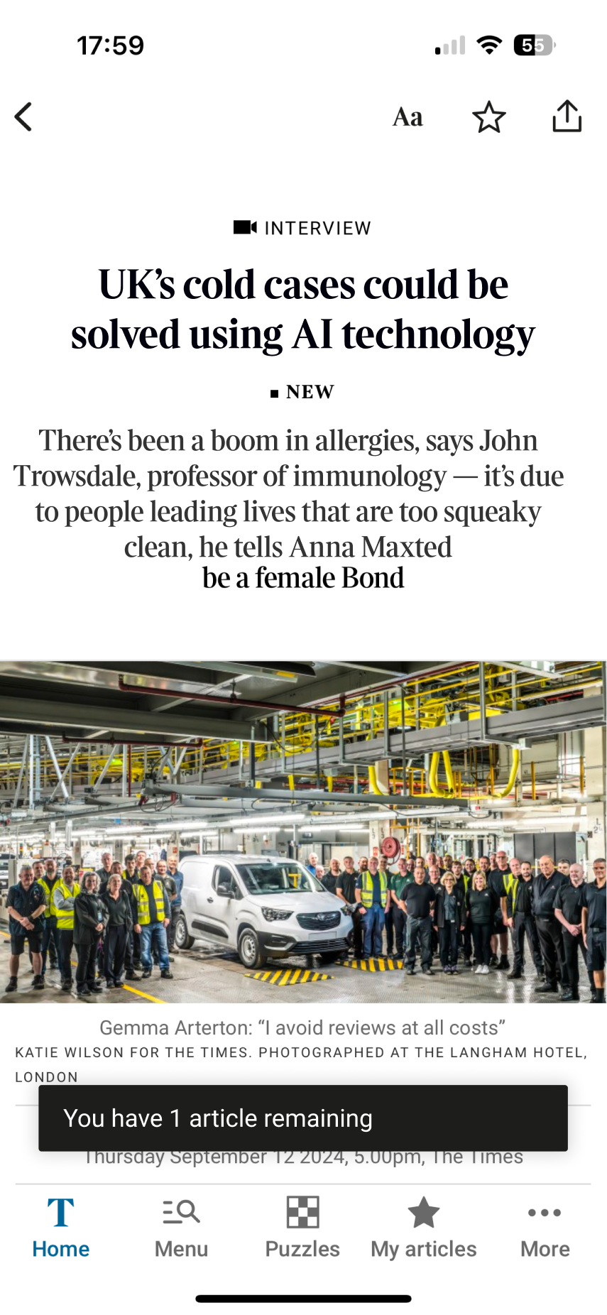

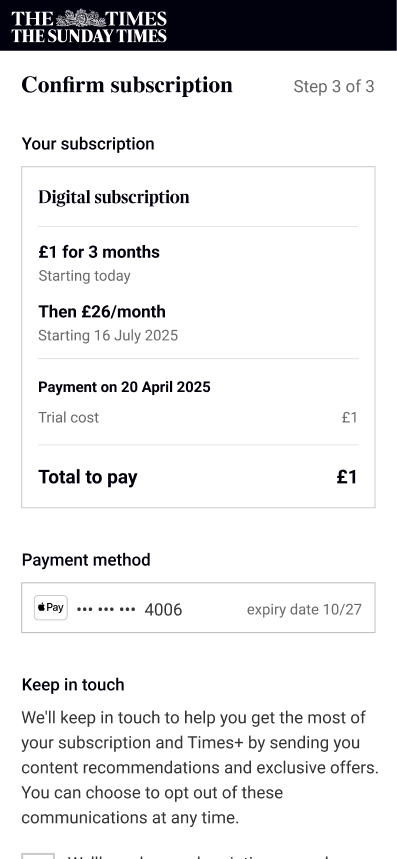
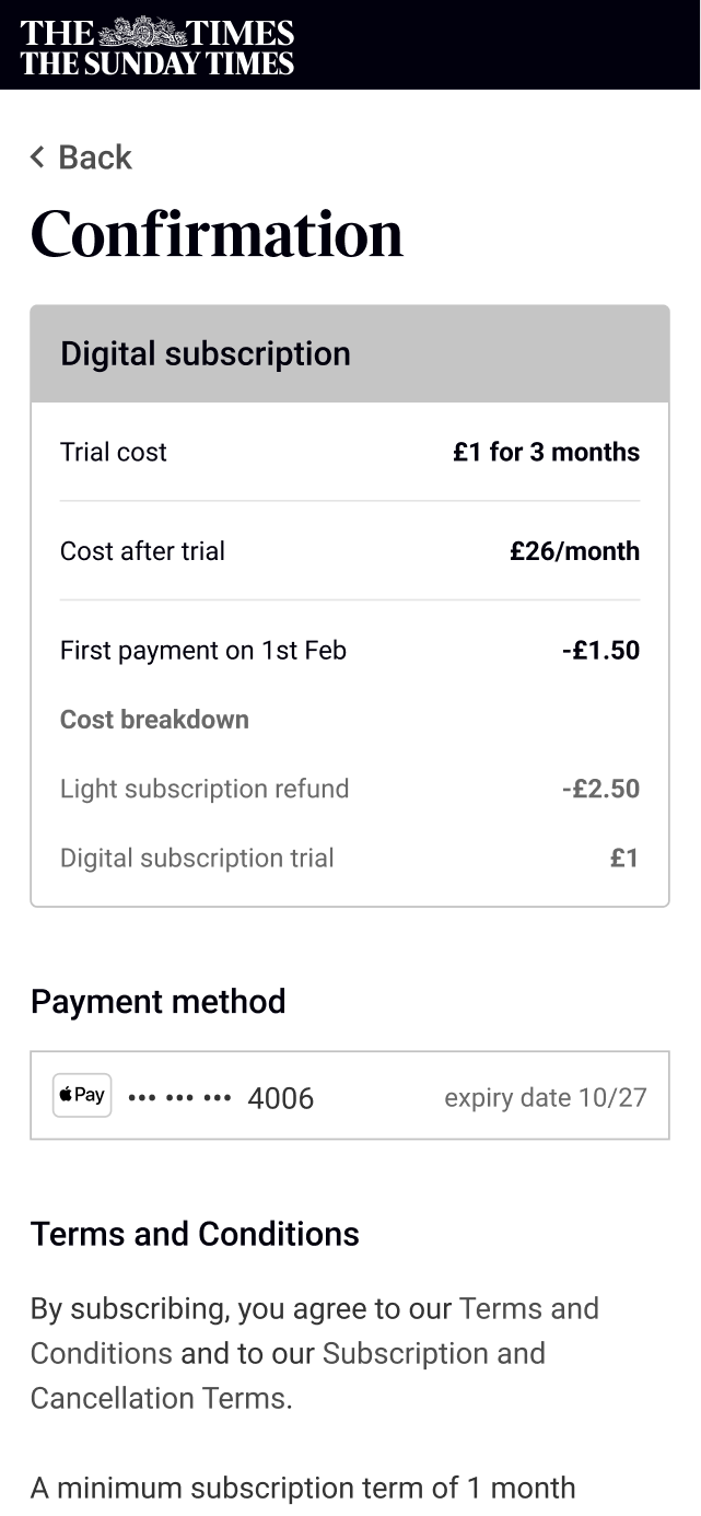
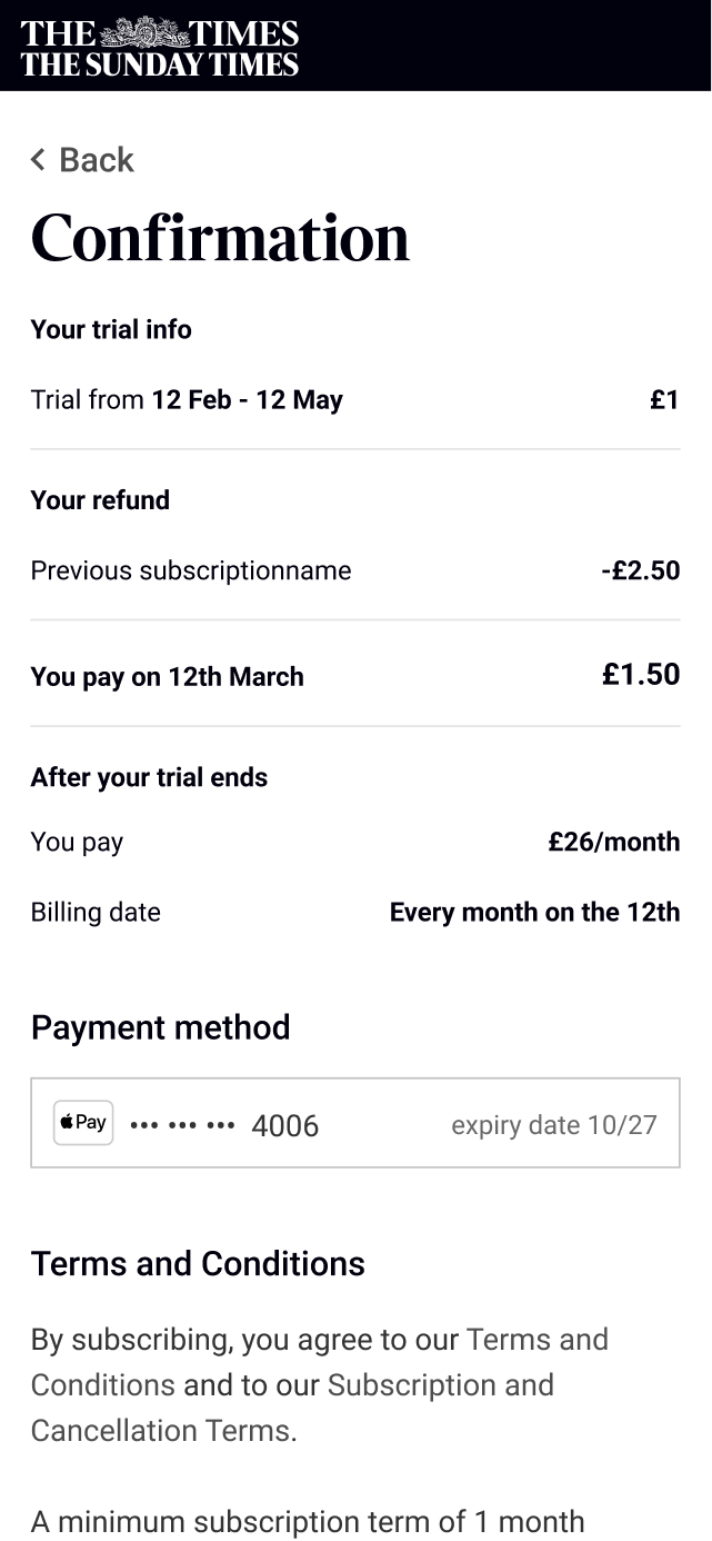
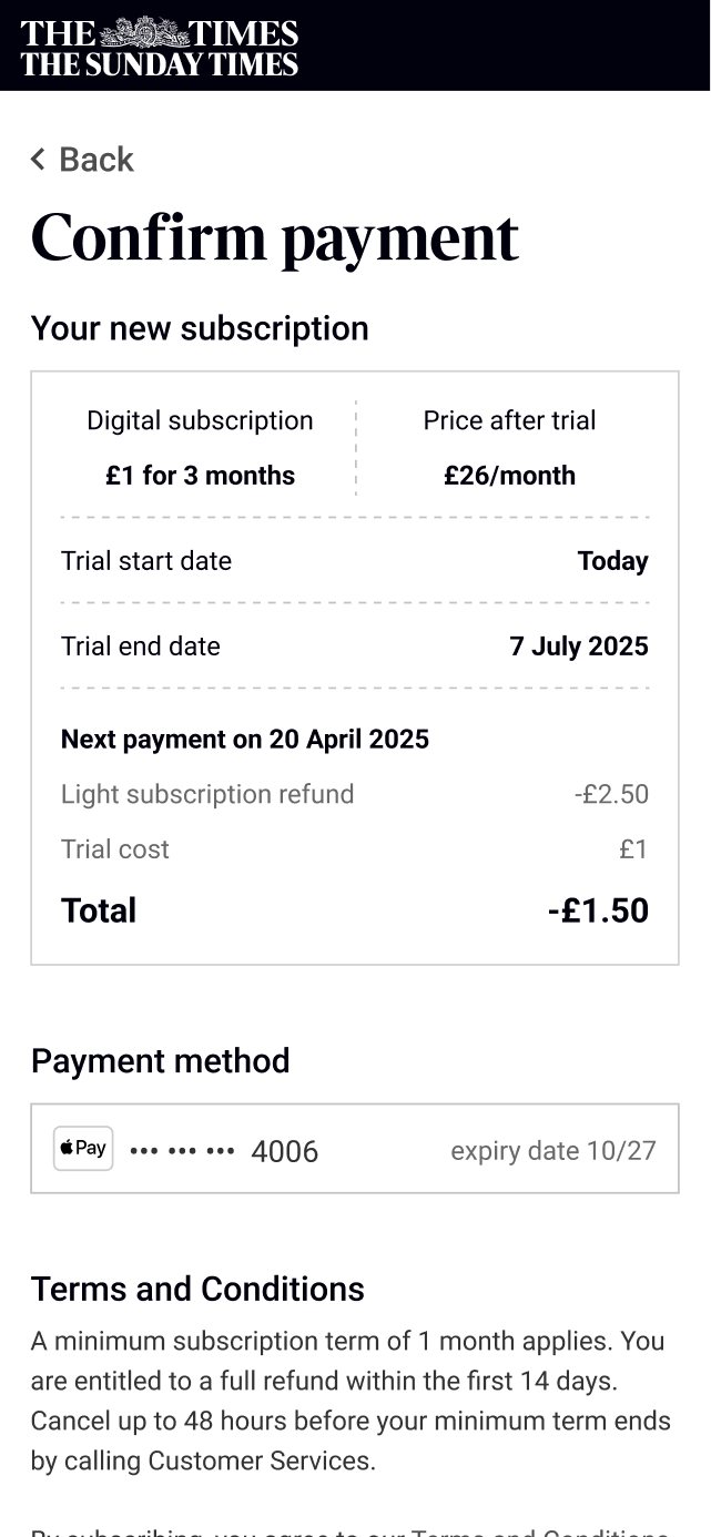
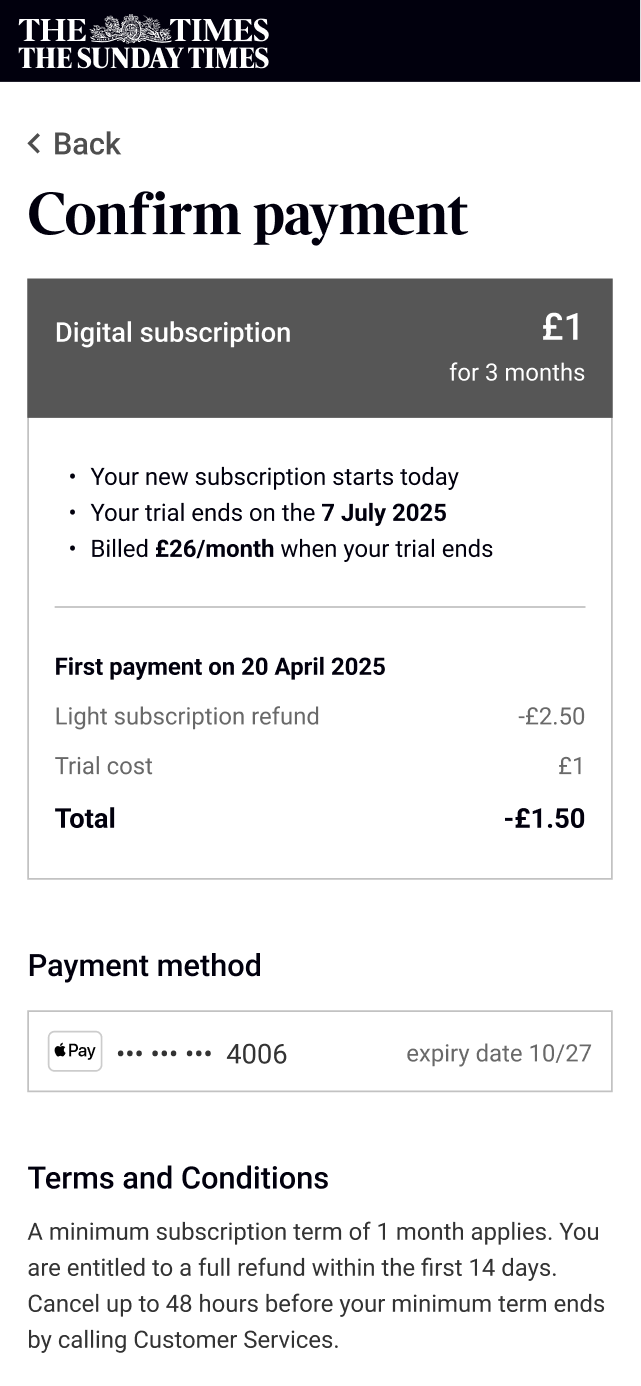
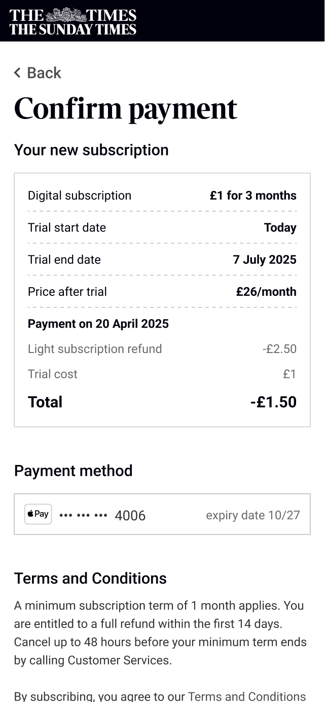
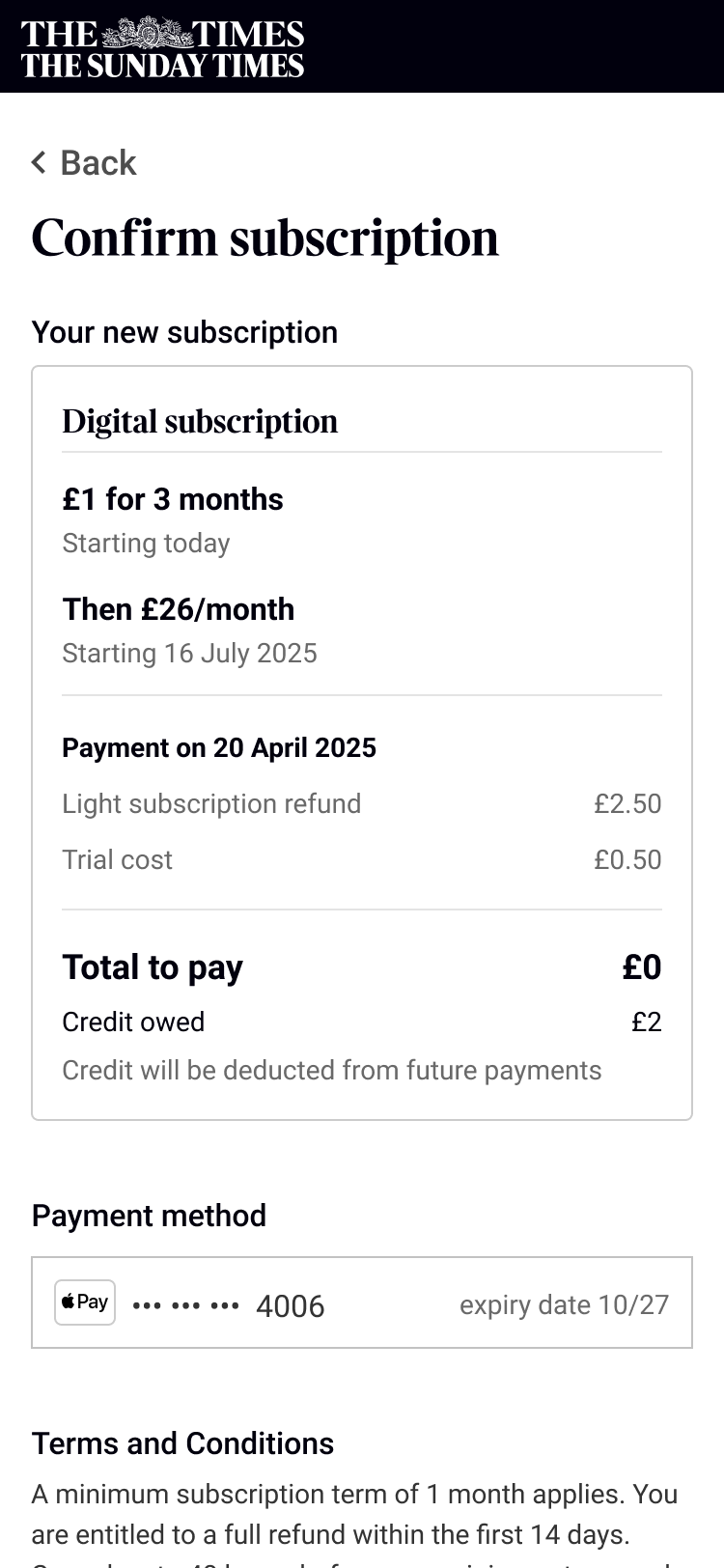
One new component was needed through: a price recap on the confirmation screen. We needed to be able to explain to users what they would be paying in the future to be compliant, and in previous user testing for the checkout flow, users we wanting more information about what they would be.
The billing challenge
The engineering team uncovered a pretty big constraint that became the main design challenge: we could upgrade a user's pack immediately, but we couldn't change their billing date. Combined with these packs having an introductory offer, this simple component would have to work hard to make it clear to users:
- What they would pay
- When they would pay it
- When the introductory price would end
- When the full price would start
- Why the first payment isn’t the same as advertised on the storefront
I ran three rounds of usability testing with 15 participants each, focusing on two themes: clarity and usability. Could users understand how much they'd pay and when? Did they trust the upgrade journey? How easy was it to complete?
The first round revealed that users could navigate the flow successfully, but wanted much more detail about costs. I went through six iterations on the payment explanation, adding a dedicated section on the confirmation page that explained what they'd pay and when.
Version 01
Version 02
Version 03
Version 04
Version 05
Version 06
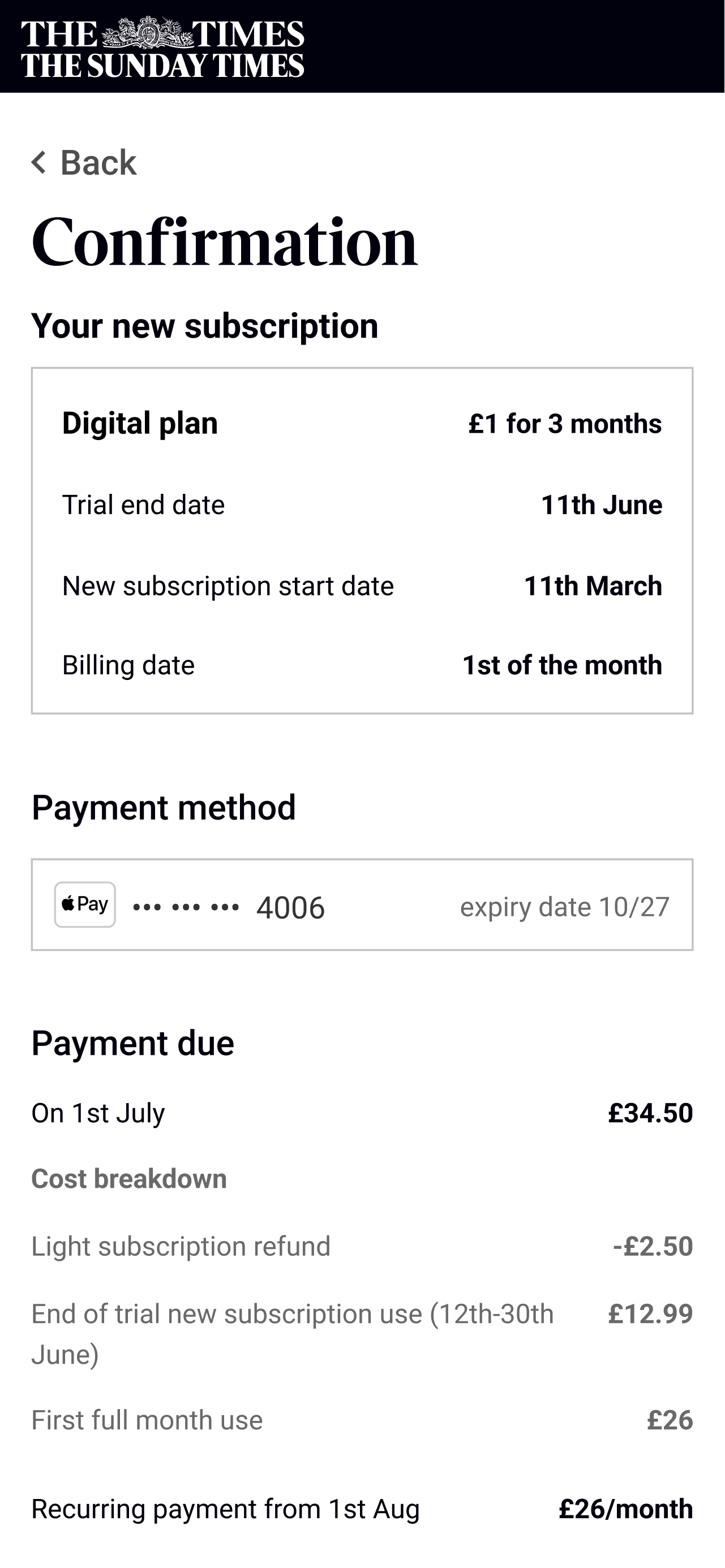
Upgrade journey financial information
By the last iteration 90% of users understood when they would pay, how much they would pay and that they would get credit towards future payments.
Research key findings
90% of users understood:
- That their subscription started on the day of the upgrade
- That they payment would be taken later since their billing wasn’t changing
- Their would initially pay the trial price before moving onto the full price
Balancing discovery and restriction
There was one main issue to solve: how do you let users discover premium features exist without creating constant frustration from being blocked?
To start to figure this out I looked at what competitors were doing to encourage users to upgrade.
Launch & Impact
Establishing the Foundation
The immediate outcome was capability, not conversion. For the first time, The Times could properly gate features—all users were now restricted to their appropriate tier. The marketing team could create subscription packs with any combination of entitlements and preview exactly how blockers would appear.
Early Signals
After launch, we introduced a new version of a light pack (our lowest tier offering). A meaningful proportion of those subscribers upgraded to the premium pack. More importantly, these upgraded users churned at a lower rate than users who purchased the premium pack directly.
We believe this happened because we sold light packs to "cold" audiences—users we expected to have lower engagement. By letting them try a limited version first, we converted users who might never have purchased premium directly. Their churn rate was still higher than our highly engaged "hot" audience, but lower than we'd expected for cold-audience conversions.
An unexpected finding emerged from the data: users who upgraded consistently hit their 30-article monthly limit, whereas most users in the same tier previously read fewer than 20 articles. The upgrade journey was successfully identifying and converting our most engaged users.
I moved teams before we could iterate further on the experience or gather complete conversion metrics. The system I built established the baseline—future designers would optimise from there.
A footer because no website would be complete without one