The Times checkout had not been worked on for 5 years. The tech was old, the design was old, it looked old. For this project I led the re-design, working with marketing stakeholders and my product team to rebuild the checkout platform so that we could make some much needed improvements and be able to launch test at a faster pace.
UX, UI, User research
Redesigning The Times Checkout
Role
Rob
Home
About
A footer because no website would be complete without one
Context
The Times aimed to increase conversion rate by improve the checkout flow once a user by making it shorter, simpler to understand and bringing the UI up to date with The Times refresh.
Problem
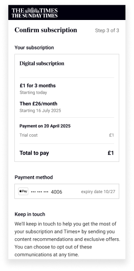
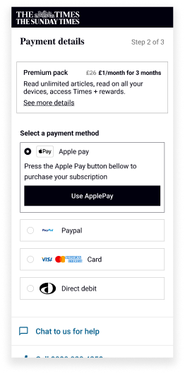
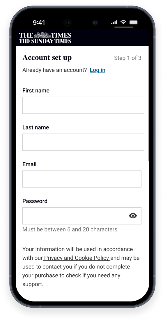
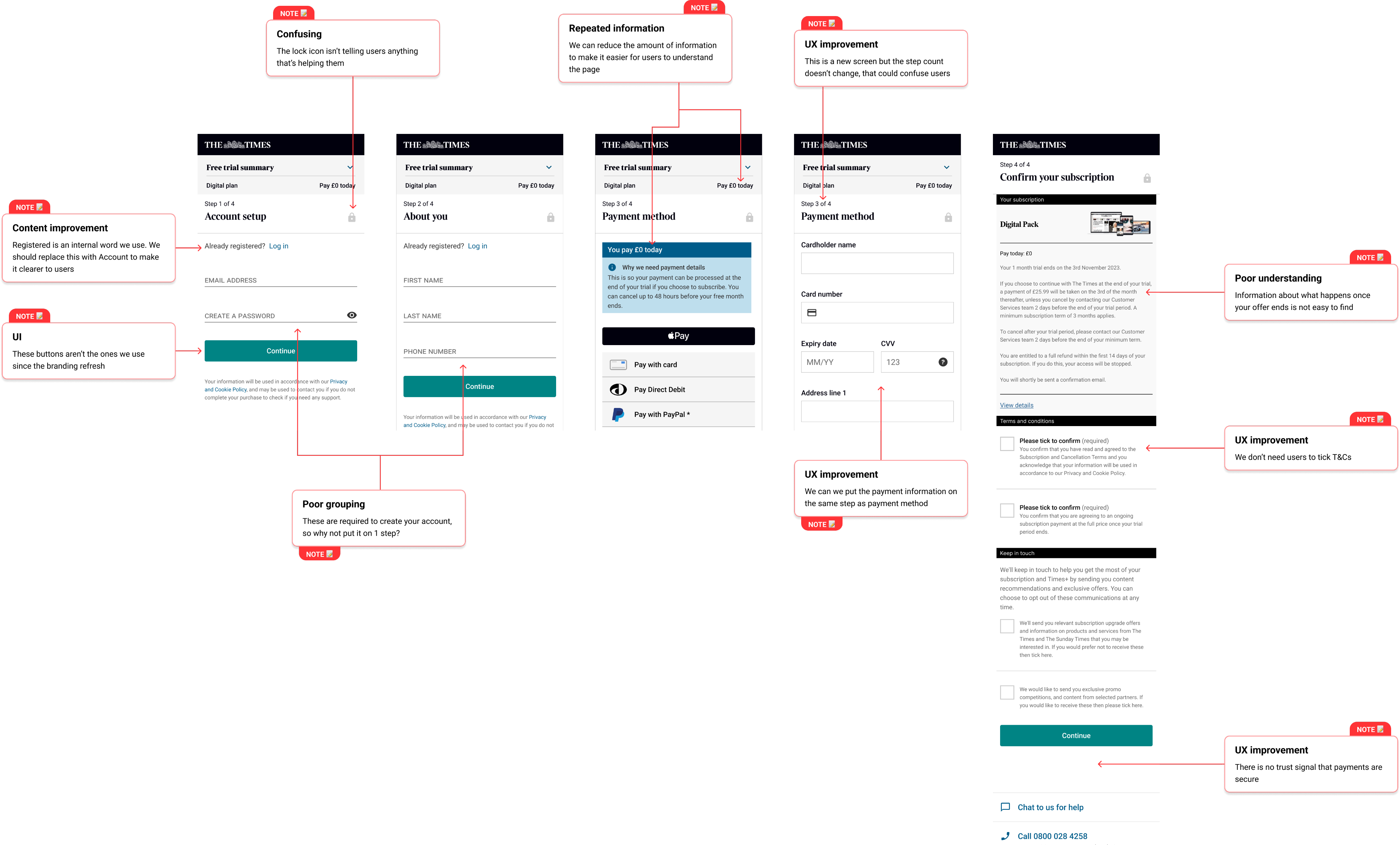
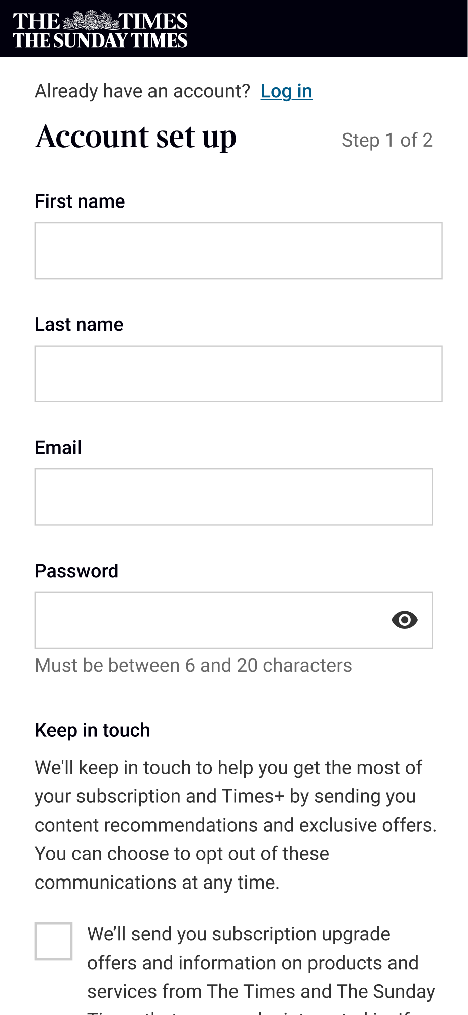
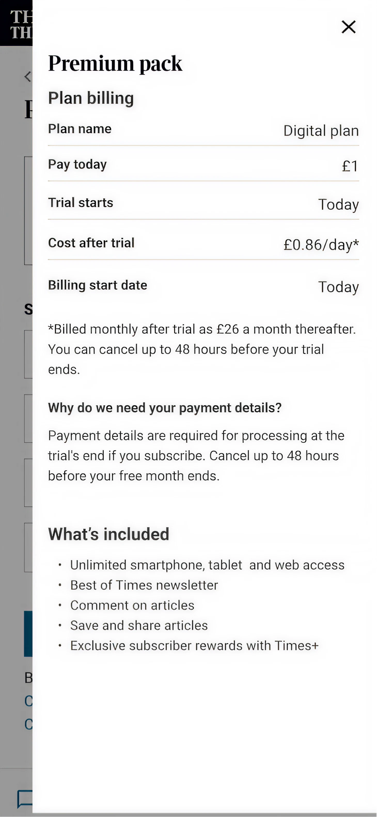
Information users had to provide was spread over multiple steps even though they were related to each other, making the process seem longer than it was. The confirmation page was text heavy making it hard for users to understand what they would pay and when.
Solution
Prioritised solutions based on an audit, competitor research and gauging the effort vs reward by running workshops with the product team and stakeholders. My solutions were to shorten the journey by grouping similar information, replacing text with text light components and improving the UI to help users understand each step.
Impact
-14% drop off during the flow, +4.5% increase in conversion and improved users understanding of the financial of the subscription by improving how information was presented to users.
Step 1: Lay of the land
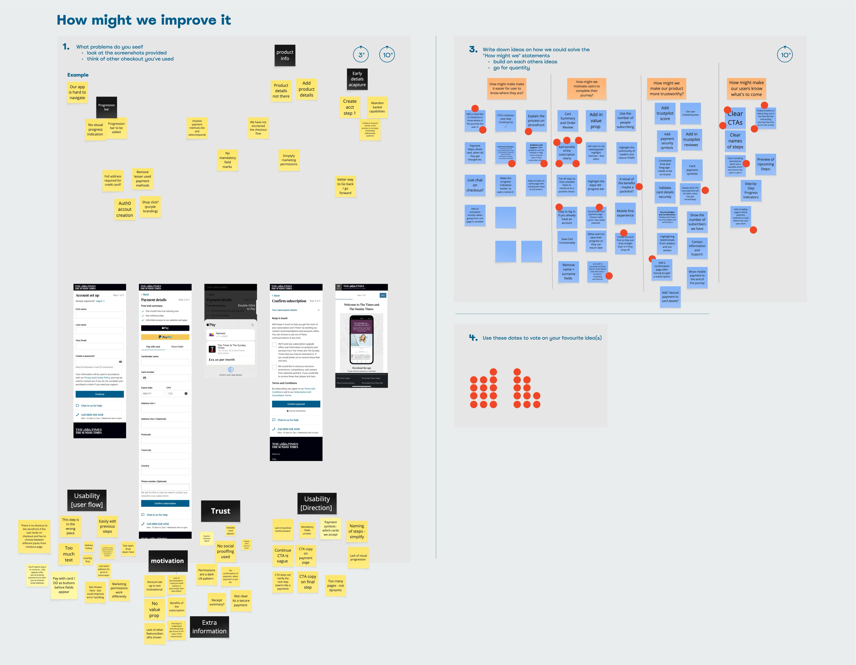
To figure out what needed to be done on the design side, I audited our checkout, looked at what direct and indirect competitors did and ran a workshop with the product team and stakeholders to understand what they thought could be improved.
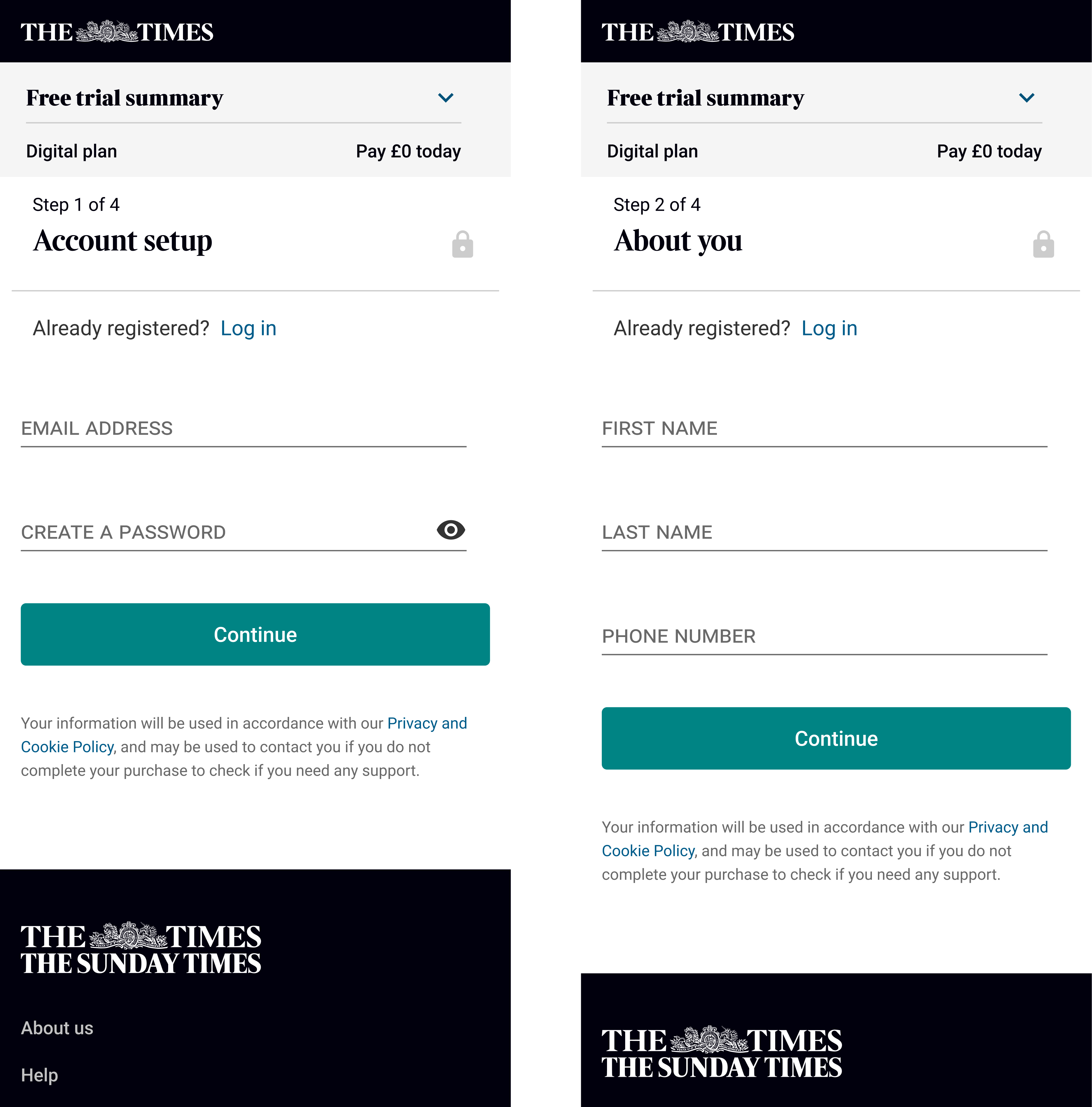
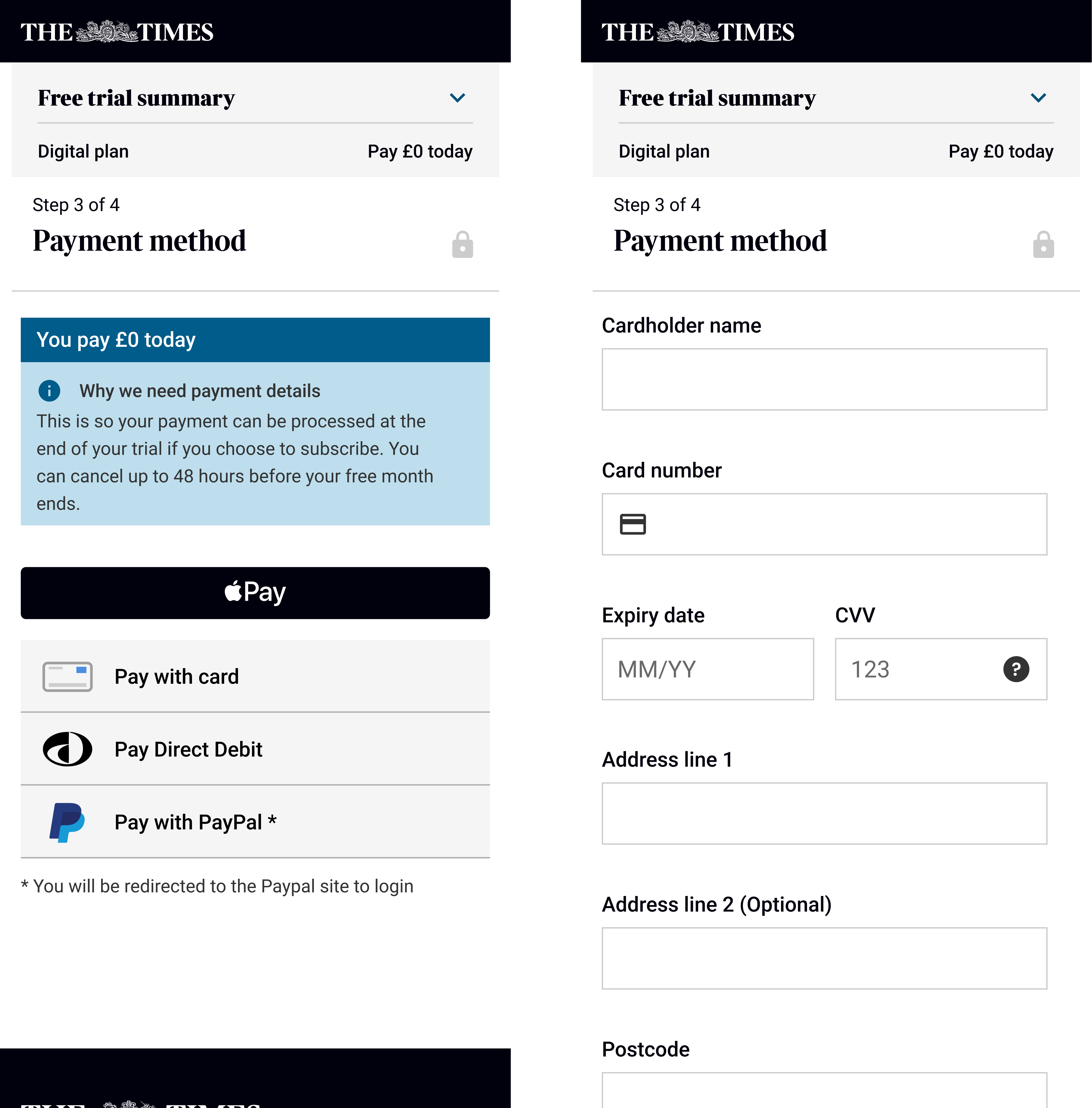
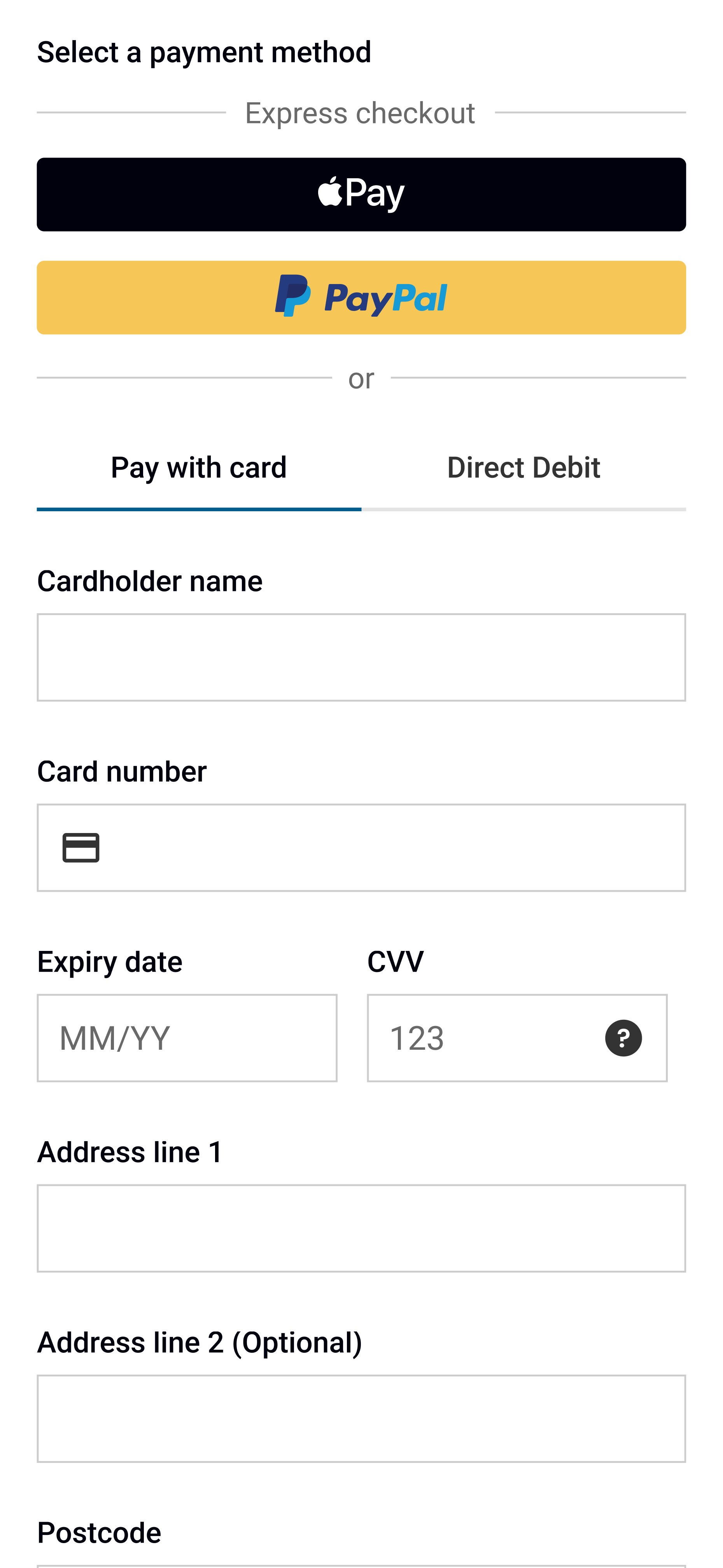
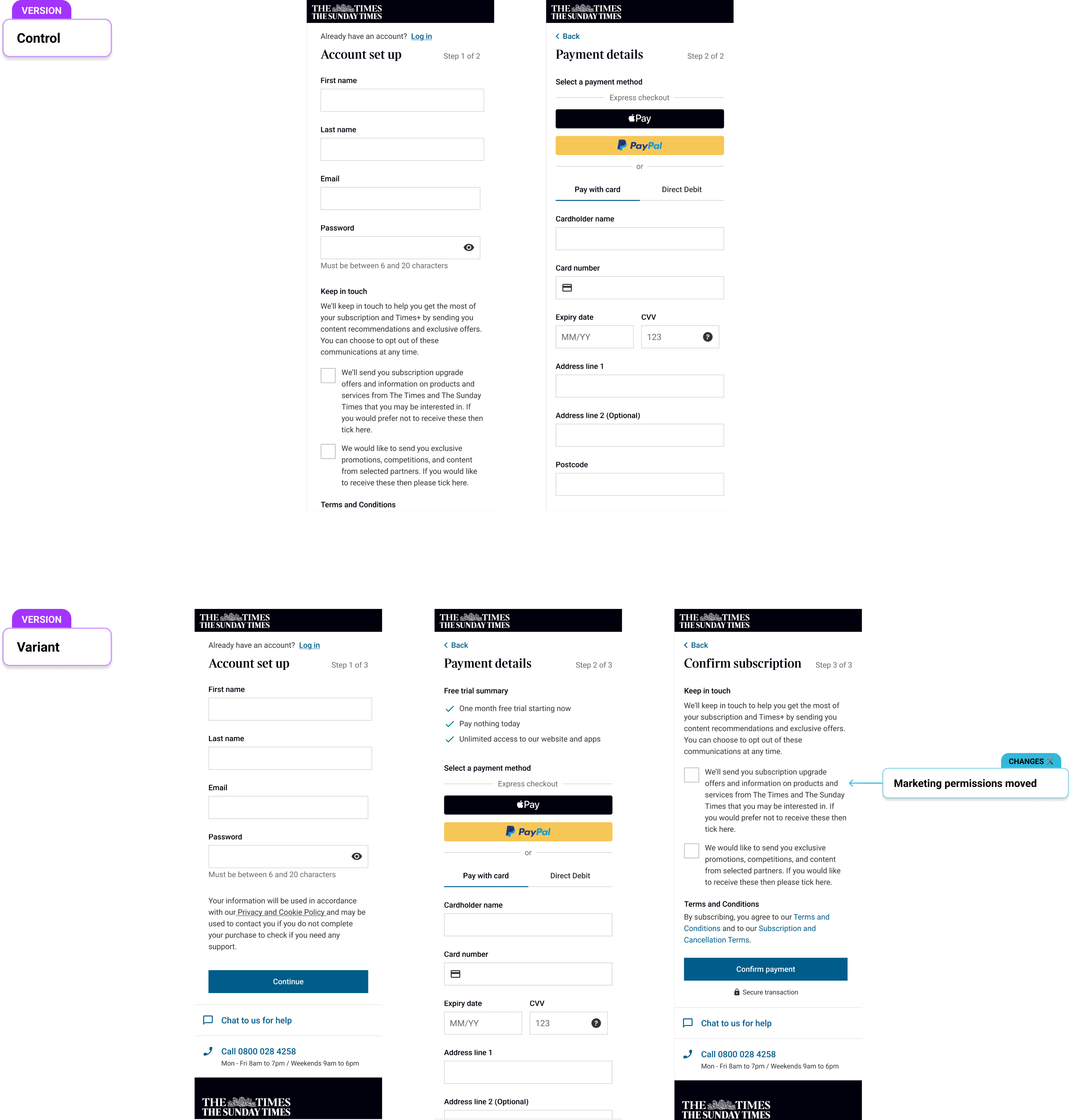
First The Times checkout. When you lay every step, the first improvement that hits you is how long it is. It could be made shorter if we grouped common information. The second improvement you notice is the UI. It looks old (I agree that The Times is an old company, but it can still look like it hasn’t just discovered the internet).
Audit of the checkout journey
Second activity…. You’ve guessed it, competitor analysis. I looked at direct (The New York Times, The Telegraph, The Guardian, Le Monde…) and indirect competitors (Spotify, Netflix, Disney…) and they all have common aspects:
• Short journeys
• The UI matches the rest of the site
The issues I spotted when auditing ours looked like they were the right ones to tackle.
I shared my findings with the product team and we agree that both issues should be solved.
And finally the third activity, the workshop (can you be a designer these days without running one?). Workshops are a new activity for The Times, so to get the most out of it, I adapted Crazy 8s to make it more accessible to everyone (I had previously ran a workshop were I asked stakeholders to sketch down their ideas, and they struggled to put any down). I laid out our checkout flow asked everyone to put post it notes on what they thought worked and didn’t work. Once these we grouped I asked everyone to write down what they thought could solve these issues (asking them to write them removed the sketching barrier and I got a lot more ideas from them this time round! Great success).
To get agreement on what we should focus on, we then prioritised them in terms of impact and effort.
Step 2: Designing solutions
From the prioritisation, this was the hypothesises we wanted to address first. Why? Because this area was where we were outliers compared to competitors and there were some UX best practices that were not being followed.
Hypothesis
We believe that potential subscribers will be less likely to drop out of the journey if we reduce the number of steps, leading to an increase in subscription conversion.


Improvement 1
Improvement 2
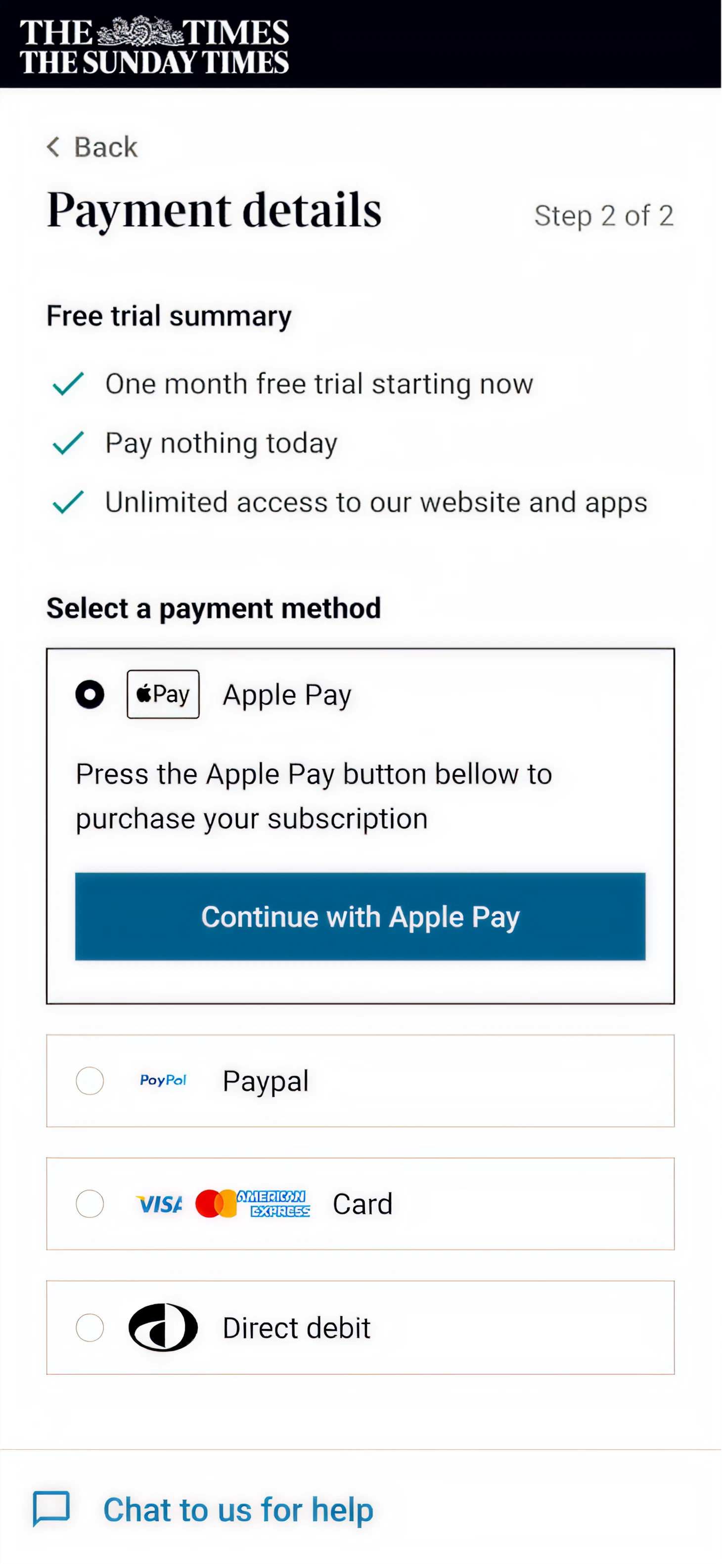
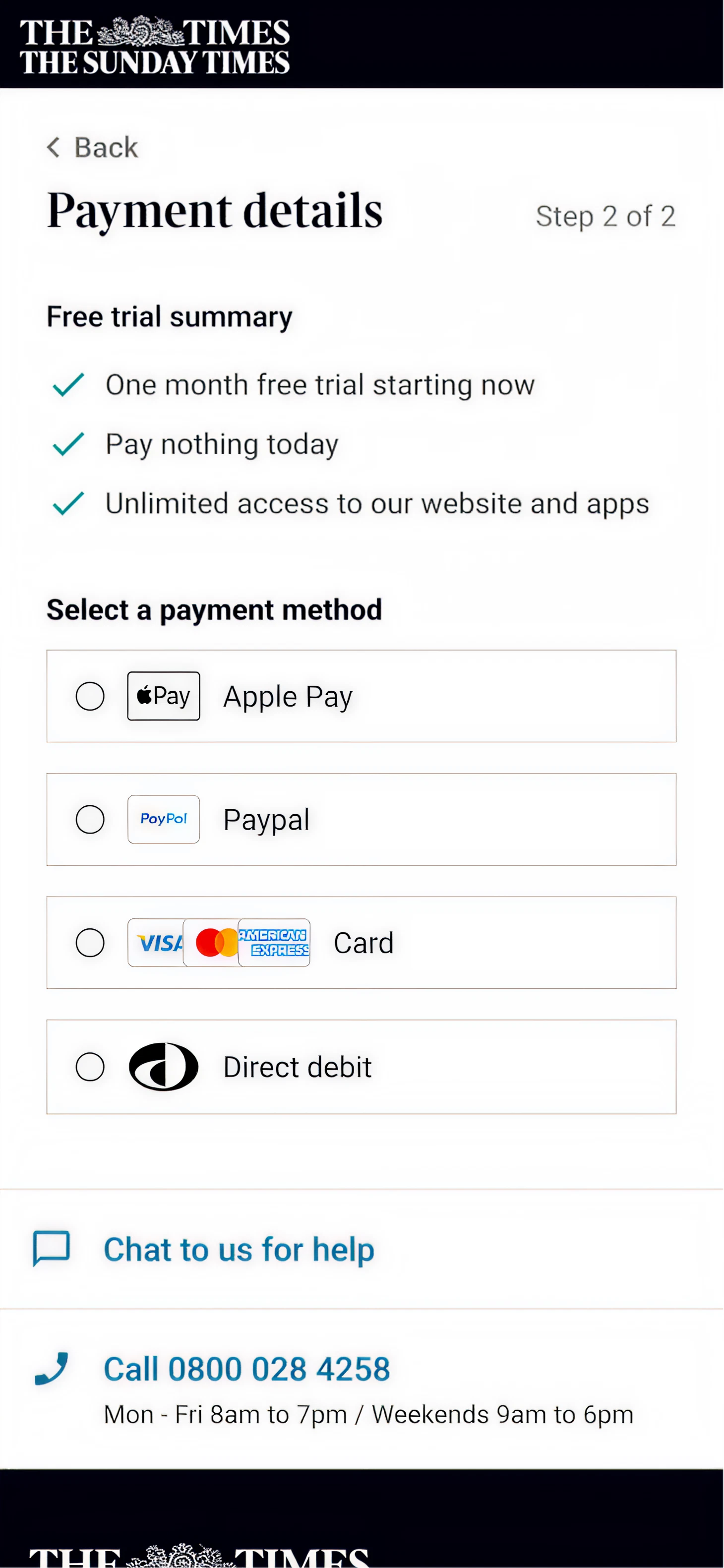
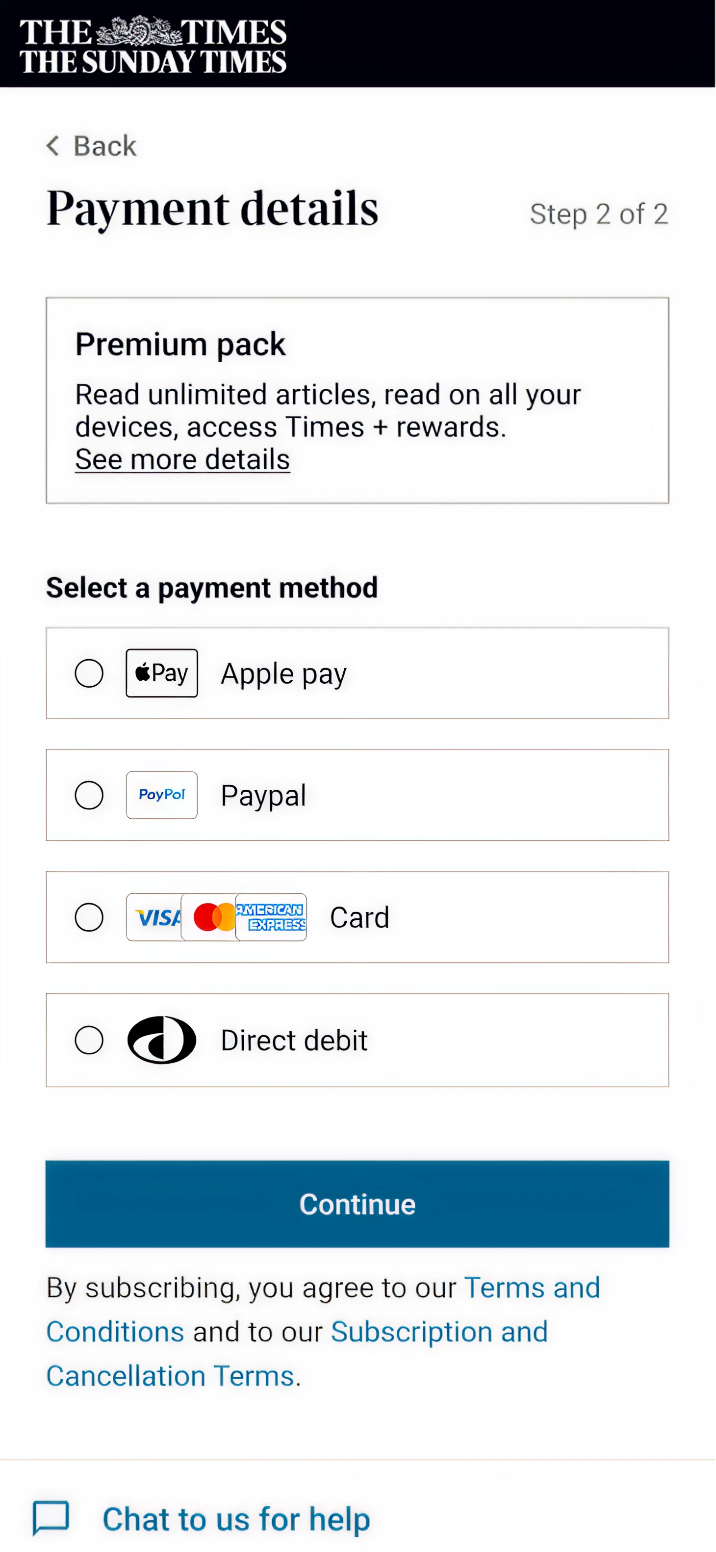
Turning the payment selection into 1 step
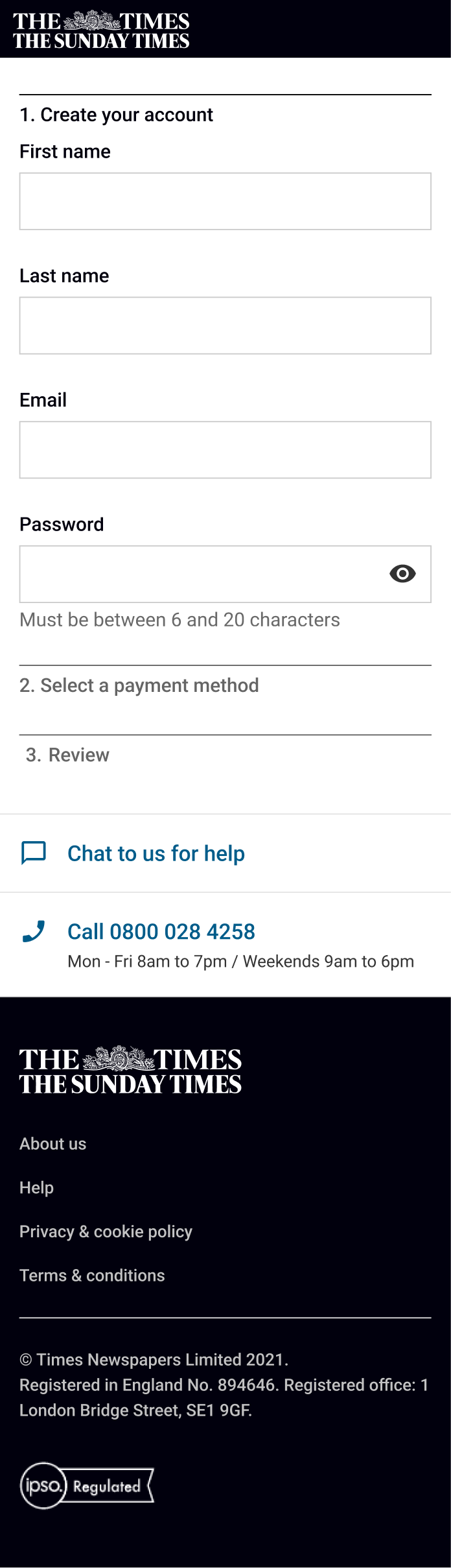
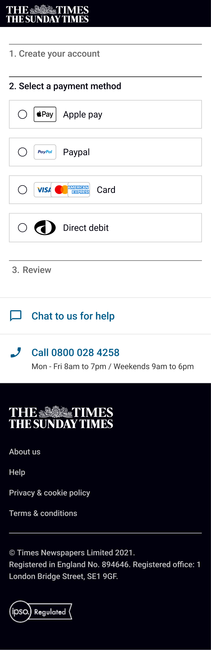
Combining the account creation into 1 step and moving marketing permissions to the front of the journey

Step 3: Validating the improved journey
With the mock up created and turned into a prototype, time to see what potential Times customers thought of it compared to what we currently have.
I ran a usability test on 10 participants, 6 on desktop and 6 on mobile. They all went through both journeys and shared their thoughts on them (and yes half saw prototype A first and the other half saw prototype B first to avoid any bias, I’m sure that question’s popped into your head).
Overall users felt that the new version was:
faster, they rated the new checkout 4.6/5 for speed compared to 3.2/5 for the current version
nicer to look at
clearer, they rated the ease to understand the information as 4.5/5 compared 3.5/5
I also asked them when their offer period ended, the cost after the offer period and when their billing was to validate this was true (what users feel and what is true isn’t doesn’t always match up after all)
With this validated the engineers built the new journey and we launched it as an A/B test.
And what happened? We saw a +5% increase in conversion which was fantastic! But... there was a -73% opt-in to marketing permissions which meant we were be less well off in the long run since that is how we can get users to re-subscribe once they cancel.
Step 4: Iterating
We saw an increase in conversion which is what we wanted but we also saw a 73% decrease in marketing opt-ins (ouch). This was a big issue because this would impact the winback campaigns if a user cancelled. There were a few reasons as to why this could be the case.
1. Marketing permissions placement
The marketing permission placement, they use to be on the confirmation page and we had move them to the account creation one
2. Marketing permissions clarity
Marketing permissions were made clearer, on the last page they were hidden with T&Cs tick boxes so there was a change users thought they had to tick them to buy a subscription
We could only influence the placement because we removed the need to tick boxes for T&Cs since the main aim of the journey was to reduce friction.
The result
This variant increased subscription conversion by +4.5% and increased marketing opt-ins by 10%. In terms of subscription it did not perform as well as the 2 step journey but the increase in marketing permissions meant that we would make revenue because of the users we could message when they cancelled their subscription.
Future improvement
I’ve changed teams since the launch of the new checkout but there are other improvements that can be made. So before I left I have mocked up future tests the team can run (we move a bit slowly but I’m hoping these will see the day at some point). Here are some examples of them, and if there are some that you think could work for you please try them (it would be great if you could let me know if they worked or not for you)!
The end goal is to see if a one page checkout would work best. But before we build that, certain aspects need to be validated.
Hypothesis
We believe that potential subscribers will find it easier to choose a payment method if they are all presented equally, leading to an increase in subscription conversion.
Hypothesis
We believe that potential subscribers will be less likely to drop out of the journey if they are able to preview the subscription details, leading to an increase in subscription conversion.
Hypothesis
We believe that potential subscribers will be less likely to drop out of the journey if it is over one page, leading to an increase in subscription conversion.